
How to Paint a Portrait from a Photo
#GJWart #portraitpainting #portraitart #oilpainting #oilpaint #potrait #painting #drawing #art #arts #traditionalart
AI GeneratedMay contain errors
Hey there, how's it going? Andrew here with another painting video, and in this video
we're going to be painting a portrait of a real hero of mine.
Harry and his wife, Weese, immigrated from Holland to New Zealand in 1950.
This was just after World War II. He settled in a small town called Shannon
in the North Island of New Zealand where he started a small chicken farm.
He had seven children, 23 grandchildren, and 16 great-grandchildren.
My wife was one of his grandchildren. I first met Harry back in 2010 when I asked
him if I could paint his portrait. I just found something about him to be so inspiring.
I could tell he was a man of integrity, someone that was true to his word,
somebody that lived life true to his own values. There was something about his nature and his
character that I wanted to try and capture in a painting. Of course, he had never been painted
before, so he found the whole experience a little bit strange, and it was quite funny just trying
to photograph him, but soon he kind of warmed to the idea and he gave me several opportunities to
get some great pictures to work from in the studio. So in this portrait demonstration,
I am going to be working from some photographs. Whenever I have a portrait shoot, I try to get a
variety of images from different angles so I can decide what to work from later in the studio.
I decided upon this angle. I just love that light coming in through the window,
and there's something really nice about that look where he's looking off the canvas.
So let's get stuck into this painting, and let me share with you some of my favorite
portrait painting techniques. Now I'm going to be working on a recycled canvas.
I've already primed this thing with a combination of umber and ultramarine blue to make a nice dark
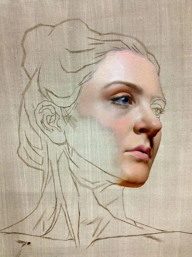
tone, and I'm going to sketch in the lines of the portrait here to make sure I get the right angle
in the gaze. Now these lines are critical for me to locate the correct position for the eyes,
nose, mouth, and ears. Once I have these lines in the correct location, I'm going to start adding
paint and just blocking in the major planes of the face. These are incredibly simple marks. I'm
using that flat edge of the dagger bristle brush, and I'm also keeping my combinations of color
really clean and simple. Now we're going to talk a lot about color and portraiture
in the next portrait demo coming your way very soon. I'm looking at my photographic reference,
and I'm trying to pick out some simple colors that I can identify quickly within some of the
portions of the face. Again, I'm trying to keep these combinations nice and simple and very clean
so there's not many different tubes of paint going into any one of these mixes,
about two or three at most. Painting a portrait in this way is a lot like painting a landscape.
We're going to start loose and very simple and very broad, and then refine the shapes
as the process progresses. Now I've already identified my lighting dynamic. I've got a
nice ambient glow coming in through that open window, but there's also a nice glow on the
opposite side of the face. This I'm going to make a little bit softer to create a little bit of
difference and maybe some tension between those two different light sources. Because my colors
are so muted and desaturated, it means that I'm going to gradually be able to increase that
saturation as the painting develops. Now I'm laying in these tiles of color, and what really
helps this technique is the shape of that brush. That wedge is one of my favorite brushes, and if
you haven't seen already, check out the link in the description below to the new Tisch brush from
Rosemary & Co. It's an awesome design, by far my favorite brush to use. I'm already starting to see
a little bit of that character of Harry coming through this initial paint layer. It's a bit of
a slow process, just building it up one tile at a time. It's really important not to be in a rush
while we're laying the foundation for our portrait. There's a time and a place for detail, and this is
at the end of the process. This block-in stage is for those big general statements, those snap
judgments, and just putting together the basic geometric shapes that make up the face. We can
really judge if these are correct by looking at them against one another. Everything's relative
here, so I'm making decisions based on how one color looks compared to another, how one shape
might turn a corner and define a form. If anything is out of place here, or anything starts to look
a little bit wrong, it can always be changed, moved, and manipulated. You may notice here, as I
accumulate these brush strokes, that I don't ever just leave one brush stroke alone. Mind you, I'm
not trying to go too far with the paint on the brush and overextend these mixes, but whenever I lay
down a stroke, I'll go down and touch it another two or three times. This will push it into another
brush stroke that had already been deposited, where I might be able to manipulate one edge,
blend it into something else, maybe knock down some of the ridge lines that have been accumulated
from that paint, being pushed up as the bristles drag through it. I'm already starting to see this
character of Harry coming through the portrait, and it's quite exciting to get that effect of
light coming through the window that I'm going to place behind him and to his right. Now, I've used
titanium white as my only white for this portrait. I've also cooled this white somewhat with a little
bit of ultramarine blue, cobalt teal, and quinacridone magenta, so that the white that you see
in the highlight is actually pretty far from pure white. I still have the possibility of increasing
the intensity of this highlight. I'm always saving my tonal best for last. Now, skin tones can be
quite tricky, so as I mentioned before, I'm trying to keep these combinations nice and simple.
My main three colors throughout any palette that I use, whether it's a landscape, seascape,
or portrait, are going to be based upon titanium white, burnt umber, and ultramarine blue.
Those are going to be in just about every palette that I use. Now, I am going to be using some earth
colors here. This will help me with the initial base of that skin tone. Yellow oxide is great to
get that yellow tinge in the skin. Burnt sienna is also great to just get a bit of a warm flush,
and it's not as intense as a cadmium red or a quinacridone crimson. Speaking of which, it's the
quinacridone crimson that you can see punching through and adding that resonance inside those
skin tones, particularly in the ears and the eyelid. Once I'm happy with the face, I'm going
to get in these main blocky shapes of the hair. Now, you'll notice that the quality of this white
is a little bit different to the highlight on the side of the face. This white is a little bit warmer,
and I've also dropped the tone with just a touch of ultramarine blue and burnt umber. It's these
subtle differences in color that really define the shape and the form. Now, with this portrait,
I'm mixing my oil colors with a little bit of oleo gel and impasto medium. This has got a bit of a
slower drying time, so it's giving me plenty of working time. That paint's not going off, which means
I'm going to be able to blend Harry here with that background color. Now, backgrounds is something
that I get asked about all the time. What color do we choose for that background? Well, I say it depends
entirely on the color of the subject. Here, there's a lot of these vibrant, rich reds coming through
in the skin tones in Harry's face. I'm going to go for the complementary opposite, which is green,
and this is going to make for an interesting dynamic and really show off the character of
Harry's face. The ambient light coming through this window is laid down with very thick brushstrokes.
I want to retain the character of these marks in the background. Part of what's going to help me
do that is to have some difference in the brushstrokes. Not all the color here is going to
be the same. Some of it's going to be a little bit more blue, some's going to be a little bit more
green, and then there's some gray in there as well. This mottled surface kind of adds to the
interest. I don't want a flat zone of color behind Harry's face. Now, if I was paying attention to my
rule, save your tonal best for last, then that would mean that these marks here should stand
proud of my block-in layer, and still there's some room to go totally. This is still not the
lightest marks that I could put down. You'll also notice that these colors are slightly violet.
I've used a bit of quinacridone magenta, ultramarine blue, and cobalt teal here in combination with that
titanium white. I'm paying attention to the way these folds of skin work, and some of this reflected
light, and this is what's really going to start to define that form. That slight pink glow there that
you can see has got a little bit more of that quinacridone red coming through, also in
combination with titanium white. This titanium white though can get out of hand. It's very opaque,
very punchy, and it can overpower a lot of your combinations, so make sure that you tone this down
where possible, and just use it very sparingly. I just use the ends of those dagger bristles
to just flick on some sharp highlights. This also defines the form a little bit more,
and then, of course, that glow of the warm skin coming through that eyelid.
Now, with this portrait, I'm going to try to go for a little bit of a looser technique,
and allow the character of the brush strokes and a little bit more accumulation of paint
to define the shape and character. I also think this technique and approach really suits Harry's
overall nature, and might communicate a little bit more of his personality. At this point, I'm
getting quite excited about this loose accumulation of brush strokes, so I'm quite tentative with how
I apply these marks. I can overdo this technique, and I want to make sure that I stop short of just
mucking it up. Sometimes, we can add too many marks and really lose that effect, so I'll lay
down an accumulation of brush strokes, and then evaluate where I'm at, and see if it's working.
Now, of course, we laid down a really solid foundation for the face, so I know where all
of these details now are going to hang. If I didn't get those shapes and forms correct from
the outset, then I might end up in trouble at this stage in the painting, and again,
this always goes back to our initial construction lines that we laid down before we even started the
block-in. So, you can see how one technique here hinges on another. That said, it's never too late
to go back and fix something if you can identify that you made a mistake. Some of these folds of
skin, these deep grooves and wrinkles, need just a little bit more softness, so I can round out
this form and do a little bit of blending. The oleo gel and impasto medium combination is still
a little bit wet, so I can blend this new layer that's on top with that underlying layer. This
will give me a little bit more of a brushed, painterly effect. Now, I've dropped the tone of
the eye here with a bit of ultramarine blue and burnt umber, and used just a little bit of cobalt
for that sheen on the front of the eyeball. But now, he needs some spectacles. So, here I'm going
to use a broken line and go carefully and just map out where these are going to sit on the face.
I'm not trying to do a continuous line. This is a painting, after all, so I don't want to really
over-define these shapes. Just one mark at a time, laid down with that bristle dagger brush.
As long as I get the construction here right, then I'll be able to lay down some more painterly
marks over the top. This combination of colors here to make this dark tone you see is, of course,
ultramarine blue and burnt umber. Now, I'm happy with the placement of the glasses.
Time to work on these ears. Now, just to adjust the shape here, I also want this ear to catch
the light coming from the opposing window. I'm going to blend one mark in with another.
Ears are very, very strange shapes, indeed. There are so many different facets and folds,
and they also catch the light in various ways. A slow and steady approach is best.
Now, again, to get that glow coming through that fleshy ear, I'm going to be using a bit
of quinacridone red. There's also another color that I found is incredibly helpful for portraits,
and that's transparent yellow oxide. This is more of a tinting yellow, as opposed to just
normal yellow oxide, which is quite opaque. Transparent yellow oxide, as the name suggests,
is transparent, and it will just stain whatever color we add it to. It's a fantastic color and
something you definitely need on your portrait palette. It's important when painting an ear
to focus on those edges and really paying attention. Do they need to be blended,
or do they need to be sharp? This will also help define that form.
Now, let's get back to the glasses. I decided that I needed to deepen the shape here
and just darken up some of these lines. Also, the glasses are going to distort
whatever's behind them, so this eye is going to need just a touch of adjustment. It's time
to thicken up some areas of the frames. I'm happy with where these glasses, they don't need to move
anymore, and now the glasses can get just a touch of highlight either side, catching the light from
those windows. Now, in order for a shiny metallic object to really communicate its character,
it's important that we save that tonal best for last. As I mentioned, I always want to just add
a little fleck of highlight right at the very end of the process. So again, the white that you see
here is very far from pure titanium white. Sorry to pause the portrait painting demonstration,
but I just had to tell you about something. If you like painting portraits, then maybe you'd
like to check out my portrait painting tutorial available as a DVD or a download. You can find
more information about that by clicking the card up there or following the link in the description
below. Now, back to painting. Now, this painting was actually done in two sittings, and you're
looking at it here in my North Island, New Zealand studio. It came all the way from Australia.
Now, because it's been sitting in storage for just a little while, it's going to need a good dusting,
so I'm going to use a dry, clean brush to do this. I'm just going to make sure that I don't
have any animal hair on there or anything that's going to get trapped in that next layer of paint.
Once I'm happy with this, I'm going to get right back to it with some fresh paint, and I'm going
to be able to go straight over the top. Now, I decided I wanted just a bit more thickness, a bit
more impasto character, and some more brushwork in that background. Also, just a touch more adjustment
in some of the tones. Now, to add a little bit more material back here and increase the depth
in that color, I'm going to lay this down with my palette knife. I'll sometimes do this to just
work with a bit more material. I'm not too happy overall with the different shapes that are left
by the palette knife. That's not really the look that I'm after, but I use it just to add more
material, more paint, more thickness here. I'll go back and rework these areas with a brush just
to get some of those nice brush marks into that zone. Now, again, while we're talking about
backgrounds, notice that green tinge coming through and how that's playing against the red
tones in the face. Now, the other thing is the green tone that's coming through in the background
has got to be subdued. If it was of equal saturation to the face, it would detract and
take away from the character of Harry. So, it's not just simply a case of using the opposite color.
We must also think about our saturation and tone. If we've got a strong tonal dynamic in our subject,
then maybe make a less of a tonal dynamic in the background. Now, here I'm redefining the hairline
where it enters a background by using negative space, and I'm reworking into the wet paint of
the background with some new hair color here. Again, very far from titanium white. The edge of
those bristles from the bristle dagger are fantastic for laying down individual strands of
hairs or at least giving the impression that that's hair. Now, in addition to the Tisch brush, I also
really love using ivory daggers. Now, I've put together a set of my favorite Rosemary & Co. brushes
and you're going to find those by following the link in the description below. This ivory dagger
is fantastic for laying down individual strands. Just a few strands will do. Just a touch here and
there. Again, you can overdo this technique. The brain of the viewer will fill in those gaps in
detail. We don't need to overstate it at all. Now, sometimes when that dagger brush impacts the canvas,
it can leave a little bit of an artifact or a smudge. I'll go back and rework the roots of the
hair with a fan brush or a filbert and just blend this in and smudge it a little bit to make sure
that these two areas go together cohesively and they don't form any distractions for our viewer.
I'll just add a few more marks to stand proud. I'm pretty happy with the hair. It's catching
that light from those windows nicely. Now, the glasses need just a touch more definition with
some darker marks and some cool metallic grays. Again, I'm going to be using my titanium white,
umber, and ultramarine blue and a touch of quinacridone magenta to get some of the violet
in that metal color. Now, Harry is wearing bifocals, so that's the purpose of that ridgeline
that you just saw cutting through his right eye. Now, as promised, here's my tonal best,
saved for very last. I'm using just the end of a synthetic round to lay down some titanium white
mixed in with a little bit of impasto medium. I always make my highlight marks of this nature
a little bit thicker so they stand proud of the canvas and catch more light. And you can see the
difference in tone between these light hairs and that white highlight. This is what it means to
the tonal best for last. Now, of course, these eyebrow hairs are laid in here with an ivory
dagger. Again, a fantastic brush for any hair detail. Now, as you deposit paint with a brush,
sometimes those bristles are going to separate and spread out a little bit, and you'll notice
that your first marks are going to be much sharper than the subsequent marks to go down.
Always reload your brush. Make two or three marks and then pick up some more paint on the end of
those bristles, and that will mean that you'll continuously get those sharp, hair-like marks.
Now, some artists like to start with the eyes and finish them off totally before carrying on with
the rest of the portrait. I like to leave the eyes and that final detail right for the very end.
It's almost like the character of the sitter is finally revealed, and that's the reward for
spending all of these hours on a painting. Overall, I'm pretty happy with this painting.
I wish that Harry had the opportunity to see it. It's almost hard to believe,
looking at the final painting here, that he's gone. Whenever I paint somebody's portrait,
I always feel like I know them just a little bit better. It's a very strange sensation,
but there's something to that, I'm sure. This painting was completed in multiple studios
in about 50 to 100 hours. It was worth every moment spending it with this amazing guy.
So that's my tribute to Harry Van Ecton, an extraordinary guy who lived a long and fabulous
life, full of love, laughter, hardship, and triumph. He was a devout Christian and always
spoke his mind. Whenever I'm in the presence of somebody who inspires me, like Harry Van Ecton,
I always ask for a little piece of advice, something that I could add to my own personal
philosophy. So I asked him, if there was one piece of advice you could give me, Harry,
what would that be? He thought about it for a moment, and then he said,
always buy quality tools. I just love that. So let me just take this opportunity to give you
some of my thoughts on painting portraits. I get a lot of emails and messages from people
sharing their work with me, and it's fantastic to see examples of paintings from all around the
world. A lot of these paintings, though, are of A-list celebrities, a lot of well-known figures.
And I feel that when this is done, whilst some of these paintings are fantastic, a real opportunity
is being missed. You see, we put so much more into our paintings when we paint those people
who inspire us, people we know personally, whether it's our mothers or fathers or even
extended family. These are the people that we know well. And whenever we approach a subject like that,
we end up putting so much more into the process, and more of that comes back out of the canvas
in the final article. So paint who you know, and paint who inspires you. Now, if you like this
video, then hit that like button for me. And if you want to come back for more painting videos just
like this one, make sure you subscribe to this channel. As always, you can find me on Instagram
and Facebook. But most important, make sure you're subscribed to my website
at www.andrewtichler.com. Thanks so much for watching. I'll see you again next time.