
Portrait Painting: Oil on Copper Tutorial
#GJWart #portraitpainting #portraitart #oilpainting #oilpaint #potrait #painting #drawing #art #arts #traditionalart
AI GeneratedMay contain errors
Video Summary
AI GeneratedThis guide details the technical process of oil painting on copper panels, focusing on a detailed portrait. It covers the transition from initial metal preparation and opaque base layers to advanced glazing and modeling techniques, highlighting how to manage the reflective surface of copper to achieve a balance of soft painterly effects and sharp, realistic details.
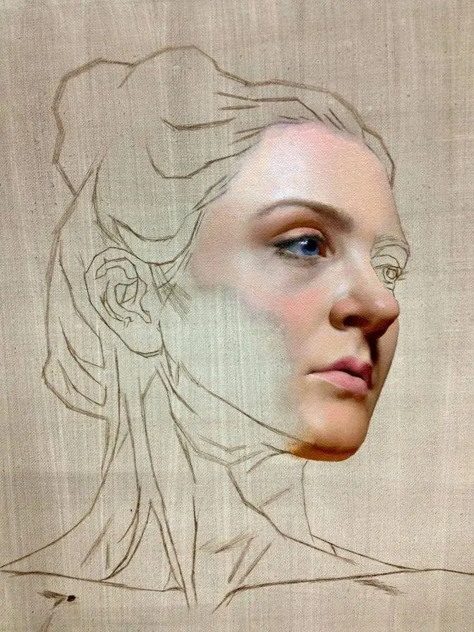
In this video I will guide you through my process of painting on copper panel.
The panel I paint on is 8 by 10 inches gallery panel from Artifex. It has warm metal semi-reflective
surface and the actual value of the panel is a bit lighter than you see on the video.
I paint on copper only when I want to leave bare metal visible so I will explain most
important differences between copper and any other surface. First, I don't want to touch
unpainted areas. Even gentle touch of the finger will leave a stain on the surface and removal of
paint will tarnish it as well. It is why I did the drawing first and transferred it using
rubber transfer method to ensure that I will not accidentally paint outside of the figure.
The transfer method is the same as for any other surface. You can find the link to a short
tutorial in the description as well as the link to the normal speed recording of this process.
Second thing, due to reflective qualities of the metal I need to make sure that surface is not too
dark or not too bright. It is very difficult to judge the values properly when the surface is
dark or light. We need some sort of medium value surface. We can adjust the value of the
surface by moving the light or putting something dark or light next to it so it will affect the
reflection. As you probably noticed I did some premixes prior. Just general group of values,
darker and warmer shadow, lighter and neutral shadow, warmer light halftone and colder halftone
which is slightly lighter. The goal of the first session is just to cover all areas with paint so
it will become a foundation for actual rendering in the next session. It means that the color per
se is not so important, only value and general temperature. Another important thing, when you
apply your first brushstrokes, especially if they are light in value, the metal will shine through
and everything will look a bit orange or pink. Don't worry if it happens, just keep covering all
the areas with opaque paint and blend strokes into each other to create even and smooth surface.
I don't use garlic or shellac here to increase the adhesion because I want to avoid any potential
mess caused by it. I just paint directly on copper and wait for the first layer to settle properly.
For that I use lead white for the light premixes and I add venetian medium into dark so all mixes
contain lead which is important for the first layer to settle properly into copper. If you wish
to avoid using lead white, you can just add a bit of venetian medium or italian varnish to all your
initial premixes. You can find all information about mediums and paint and materials in the
text description to this video. But let's talk about the process itself. I started from the eye
sockets and glabella, the one between the eyebrows, because it is easier for me to start from the
center. I choose different values for the big planes and I use changes in temperature to suggest
the local color. As I mentioned, everything has a pink tint, but my main focus is to be as accurate
as I can, especially near the outline and to leave no gaps between the shapes. For that I
constantly look at my panel from different angles to notice metal reflections among the brush strokes.
On the right bottom corner of my palette you can see venetian medium. I constantly add it to the
mixtures. To talk about the brushes, I use soft brushes, mostly sables and some of long filbert
cheap synthetic brushes. The sizes are rather small and the shapes, yes, like long filberts
and long flats are the best for this task. And I found that it is better to use soft brushes,
so bristles or medium softness will not work as good as really soft ones.
After filling the shapes in the face, I use dark mixture to fill in the hair and the light
values for the neck, so the initial value range is unfolding and I can see how the design works
in its most basic form, depicted, described by the flat shapes of almost the same color,
just with the slight changes of temperature and value. The darks are as dark as I see them
and the lights are lighter, so I will paint over them during next session and I will use
transparency to create soft and complex gradations. For strong local color areas, such as lips,
I mix cadmium red into my halftone premix, so I can indicate the nodes of strongest color already.
In the areas where the white dress is visible, I've decided to paint the skin first and add the
actual dress on top of it in the next layer. I see that the skin appears a bit darker under
the dress, so I separate the areas by painting the shoulders darker. It will help me to find
the edges later and it will also help me to show the light dress properly. My plan is to
lace the transparent whites, so I will create the lightweight effect of this dress.
Now, when all basic shapes are filled in, I've decided to start modeling, so I add more lights
and more halftones and I also see that the the dark side of her or her face has some
red tint due to reflected light, so I've decided to to add some cadmium red into this mixture as
well. So, just basic, very basic and general modeling of the form. What is really important
now is to keep everything very flat, so I don't want different areas to have different thickness
for the next layer. It will be easier to paint on top of a smooth and unified surface.
But you can see now how eyes, for example, they have no form, it's just an indication
of different shapes. Some areas, they have the sense of form, while others are just still the
same. Anyhow, as I mentioned before, it is very important to leave no gaps between the brush
strokes, so we use different angles, look from different directions, just try to find all these
little reflections of the metal. And to close this session, I just need to smooth things up,
just make things flat and even, and all I need to do is just to let it dry.
I start a new layer by oiling out carefully the surface. I apply walnut oil gel only inside of
the figure, so the copper in the background remains untouched. As per usual, I start by
mixing something dark. I mix some neutral dark first and immediately I create warmer variation
of it, so I can balance between the temperatures. You can see two mediums on the right side of the
palette. Transparent is walnut oil gel and the milky one is venetian medium. Diluting the paint
with the gel, I can use it as a glaze, so I add some darks inside of the eye to form the shape of
it. The eyes are most flat at this stage, so I feel like I need to model them first, also because
it is natural focal point and I will return there over and over during the process. I use the same
soft long filbert brush to apply the paint and to blend it in, as well as to model the form gently
by moving the paint. I constantly squint my eyes, so I don't see the details and I can focus on the
general representation of the eyes. All the edges are soft at this point. I also try to solve some
problems of the drawing as I go, trying to define smaller shapes now and also to find better
relationships in the features. In the delicate process of portrait painting we are gradually
solving drawing issues, so I prefer to build the big forms first and paint smaller with more
precision later on top of correct big shapes. You can see how my brushstrokes are smaller now and
they look almost as hatches. I follow the same logic as if I was drawing with pencil or charcoal,
using direction of the strokes to indicate the flow of form and to add visual variety in the
skin tones. The second layer is most relaxing for me, especially if the first was done properly
and there are no big drawing mistakes to fix. If you struggle a lot with likeness or with
drawing as it is, try to invest more time into the first layer. Transfer the drawing first,
paint slowly, squint your eyes often and check how your painting looks from the distance.
With practice you will find your way to create solid base for the rendering and modeling the form.
As second layer is building up, I start to expand the color range of the skin tones.
I add more blues to the highlights and look for the greens in the transitional half tones.
Some areas are still flat, so I try to model the form looking for three-dimensional representation.
And if you want to follow along and paint your version, there is a thoroughly edited almost
real-time version of this video, which you can watch with different speed and navigate using
chapters. Now you can see that the half tones of the second layer are darker than in the first,
and in this case I am building darks on top of the light, which helps me to keep skin tones
saturated. Keep in mind if the colors look washed out in the light, it means there is too much of
white in the mixture, and we need to paint slightly darker. And the white of the dress
helps us as well to see that even the lightest values in the skin are darker than the values of
the laces of the dress. By scumbling lights into the shadow and adding darks on top of it,
I show softness of the light and define the shape of the shadow better. There are reflected lights
and darker accents which I want to represent. Adding reds to the side of the neck helps me
maintain integrity of the colors, since I did the same to the side of the face before.
I try to mix inside and around my initial low-chroma pool on my palette. I want to make
gradual and subtle steps both in value and color. The skin is too delicate and light is too soft
to paint with strong contrast. When the values of the neck look more correct, I can now crank up
the lights in the face. For that I use lighter mixture and at the same time I increase the
thickness of the paint there. I use more paint and also I am adding venetian medium to build up
semi-transparent impastos in the light planes of the forehead, the nose and the cheeks. I also jump
back to the darker side of the face to refine the design of the shapes and make better transitions.
It is very important to squint your eyes now to check if the big forms are still reading the same
way as on reference. Now you can see the moment when I don't like the outline in the neck and I
have to make a decision. Either paint over but it will make the neck eventually wider or just to
erase that unlucky shape. I went for the latter option and first I erase it quickly with a q-tip
dipped in the gum salt but it leaves unpleasant stain so I came up with idea of expanding the
hair shape and covering the part of that stain in this way. Most lucky this time but it's better
to keep focused and maintain the outlines properly. Now it's time to continue the modeling of the
forms and adding more details. I soften the shadows where needed and make halftones darker
if it helps to describe the form better. Adding more chromatic light colors such as latin yellow
or king's blue, adjusting the shapes of the irises of the eyes and modeling the right eye
to match it with the left one is bringing this painting closer to finished state.
When we paint on such rigid surface as copper we can practice brush application and blending.
The copper is very smooth and allows us to paint with maximum precision.
The flow of transparent paint is the best here and it's really easy to add thicker areas. I recommend
to paint on such rigid surface if you want to paint something smaller in size and use the canvas for
larger pieces at least where subtle drawing and attention to details are needed. Another important
aspect. You don't need to use a lot of paint so when painting on copper I tend to use most
precious pigments. The same with the brushes. I don't use many but I keep them fresh holding the
shape providing maximum control. Synthetics are okay but they lose their shape pretty fast.
Sables maintain the shape way longer and you can load more paint even to smallest sable brushes.
Not in all the countries sables are available now so in such case just use synthetic substitutes
and replace them more often and it will be fine. Now it's time to paint the dress. The skin tones
of the shoulders are dry so I can apply transparent glazes over it without fear of smudging everything.
The lead white I mix here with Venetian medium is a bit yellowish in color and it is not as bright
as titanium so if you use titanium I suggest to mix it with tiny bit of cadmium yellow pale
or latin yellow to get rid of unnatural white chalk appearance. Anyways I mix it with a medium
to create transparent creamy mixture so the bottom layer will remain visible under the brushstrokes.
With blending brush I soften the glaze to make it feel more like lightweight cloth
and now with a sable brush I apply dots of mixtures on top and add more thickness to the seams.
When I see that everything is in place I mix dark brown mixture and add a bit of medium to
increase the flow and using long strokes I paint the cast shadows. They add to illusion of the
rest of the body. When I paint the clavicles I try not to over model the area so the face will
remain most elaborated part. My main priority is the cylindrical appearance of the clavicles
and with just some hints of reds on the top planes. The rest of the second session is mostly
revisiting all the areas, refining the drawing, adding details and gradually building up the
highlights. I want this painting to retain visual freshness and it is why I don't rush with
blending of everything especially in the face. Technically we can finish this painting at this
stage but I want to work on it a bit more to let it dry and paint another semi-transparent
layer to achieve soft but at the same time painterly look. You can see now how I touch
the surface gently with a clean round sable brush to flatten the strokes and prepare the
area for the next session. Sometimes it is not easy to explain the way of applying so many brush
strokes and how it should just lead to proper representation so I highly recommend just to
watch and to observe the way of application and build your own methods of doing such things.
I use palette knife to add the highlights in the eyes. It is the best way to achieve really sharp
edges and as far as I can see on my reference these highlights are going to be the sharpest
edges of the painting. So to conclude the second session I paint on top of generalized first layer
with both transparent and opaque application depending on the area. I build the illusion of
form both with values and with thickness of the paint. I add more colors especially in the
transitions and local color areas. I make decision about sharpest edge, darkest dark and lightest
light and I make sure that the edges are mostly soft and there are no big issues with the drawing.
The third and the last session begins as previous one with oiling out of everything
except for the metal itself and I use walnut oil gel as usual. Walnut oil
takes a bit more time to dry than linseed oil and it means I can use very little amount of it
and the surface will stay wet until the end of the session. Since the second layer has
dried thoroughly I can see now that some areas in the hair are still very transparent. We can
even see the lines of the drawing. So all I do I just mix dark hair mixture and apply thick opaque
darks with a sable brush. I will repeat again such brushes are essential for this method of painting
mostly because I can control the edge and the shape of each of my brush strokes.
Generally speaking everything is more or less correct so I can focus on temperatures and colors
I mix colder light half tones for the skin mostly for the neck area and I apply it on top
to balance the color and at the same time to increase the sense of form. When skin tones are
dry it is easier to see which color is missing or which area requires more attention so I add more
colder highlights and I continue blending and rendering the subtle forms of the muzzle of the
lips and especially in the transitional half tones. At this stage of painting I don't squint
anymore and I zoom into my reference image to see how can I paint the planes in the light
which values are almost the same. It means that I need to mix the same value but with different
temperature or different hue. You can see such areas on the lighter side of the face
especially in the cheekbone area or on the bottom planes of the face. I switch to the chest and
clavicles for the last time to add bluish highlights and reddish local color accents
and to make sure that the area doesn't look flat. Near the end of the session I spent more time in
the focal point final blendings additional highlights and more colors like those beautiful
greenish eyelids. When the painting is done make sure it dries in a dust-free area and I also
recommend to wear cotton gloves when you need to carry the panel or to move it into or out of the
easel. When the painting is dry I cover the whole panel with varnish. I use gum bar which means I
can protect the painting as soon as it is dry to touch. I varnish bare metal areas as well as sides
since it is a gallery panel and the copper continues to the sides. When I need to ship
the painting I don't wrap it with plastic cover as I will do it with other panels. I use glassine
paper instead. The varnish on the unpainted area is too fragile so the plastic can ruin it.
The glassine paper will protect it properly. Finally I add reds to the cheekbones and final
impasto in the lightest planes and the painting is technically done. The whole process of actual
painting took around six hours. I've edited the process and sped it up just a bit to make shorter
but at the same time thorough video version. There is no voice just background music so you can use
it as real-time visual illustration of the process. By using YouTube chapters you can quickly
navigate through the whole process and to jump back and forward to see certain moments.
Hope you will find both of the versions helpful and let me know in the comments below if you have
any questions.