
How I Get a Glazing Effect Using Direct Painting
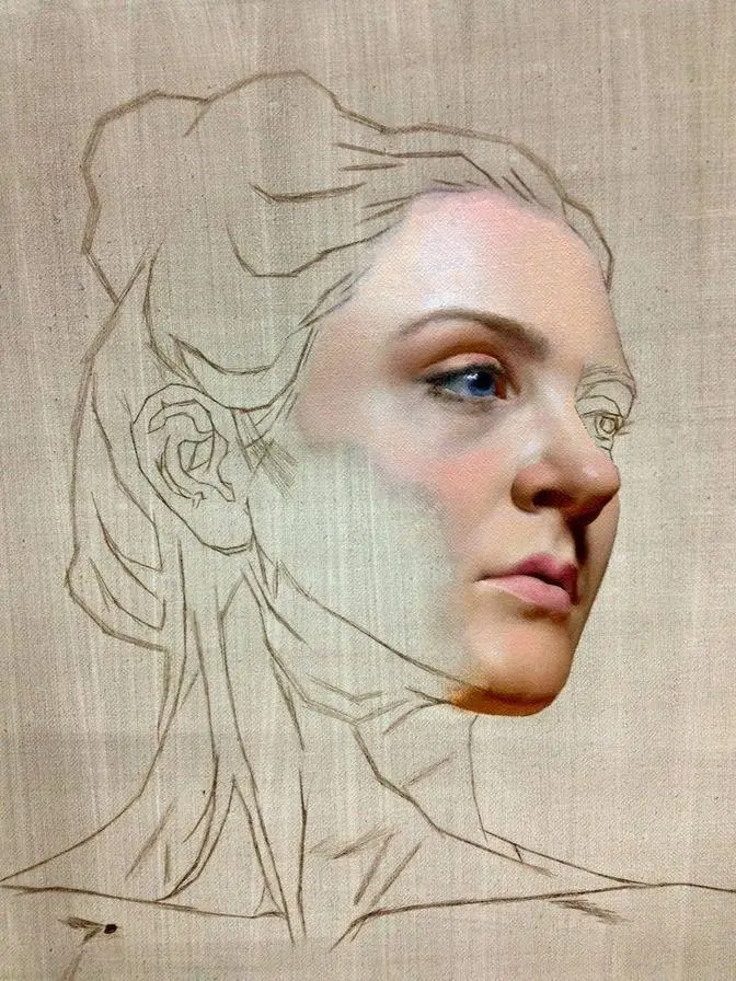
#GJWart #portraitpainting #portraitart #oilpainting #oilpaint #potrait #painting #drawing #art #arts #traditionalart
AI GeneratedMay contain errors
Today's tutorial is about mixing skin tones. I want to share some tips if you're struggling to
create realistic skin colors. Before we mix any skin tone, the first thing we need to consider
is the ground, the color underneath the painting. Because it will influence how every color
appears on the surface, your ground should usually be slightly darker than the pure white colors.
Why? Because most pigments are not complete opaque, they're somewhat translucent like
can travel into the paint layer, interact with the surface underneath, and come back through.
If your ground is too white, your colors can easily start to feel chalky or disconnected.
The second thing is color proportion. Before we start painting, we need to decide our color range.
Where is your highest chroma area? Where is your lowest chroma area?
For this portrait, I'm choosing the cheek as the highest chroma area. This becomes my color limit.
Once I establish this, even my warmest color should not go beyond it. This idea is always
running in my mind. Because remember, we can translate the color of the light,
but we can never directly copy a spectrum.
So how do we create the right color proportion in the skin? This is my basic color proportion
system. It doesn't mean you should copy these exact colors. Instead, I want to develop a way
of thinking, thinking about the relationship between different ranges of colors. In other
words, how you balance cool and warm temperatures within the skin. First, look at the light area.
The highest chroma is often found in the light-facing areas, especially around the cheeks,
because these areas receive direct light and maintain stronger local color. As we move into
the middle tones, the value goes down. Because we're seeing less of the surface light, the color
usually starts to lose chroma and becomes more neutral. This transition is extremely important.
A lot of beginners try to make every area colorful, but skin tones actually contain
a lot of subtle gray tones. These natural areas help describe the translucency of the skin
and make the stronger colors feel much more powerful. Then around the edges or turning areas,
the color can sometimes come back again. Depending on the thickness of the flesh, overlapping forms,
and the surrounding environment, you might see another increase in warmth or saturation.
But remember, this color should support your highest chroma area. It should never
compare with it. Now let's talk about shadow. Many people think shadows are just dark versions
of the skin color. But shadows are also influenced by reflected light. For example, the cheek shadow
might receive reflected color from closing the environment or nearby surface. So instead of
only asking, what color do I see? Try asking, where is this color coming from? Thank you guys
for watching. I hope this tutorial helps you understand skin tones and improve your painting.
I'll see you in the next video. I love you guys!