
Oil Portrait Inspired by Master Techniques
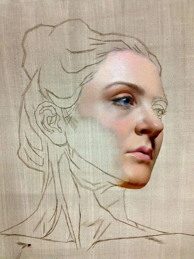
Apr 15, 2026
After months of research in both old and contemporary masters,
I have found myself completely and utterly obsessed with the art of portrait painting.
I used to think that the key to a perfect portrait was replicating a photograph perfectly.
But looking at my favourite portrait artists,
I realised that they do something that elevates the paintings far beyond a photograph.
These master artists are able to find colours that aren't even in the reference.
In today's video, I want to talk about all the master techniques
which have been fuelling my practice at the moment.
Everything that helps these artists create enchanting portraits.
Starting with a method that helps me get near perfect proportions every time,
and it's starting off with negative shapes.
This is where you wipe away the paint to create the form.
Instead of marking out your subject using pencil or lines,
you're blocking it out using shapes.
I used to always think that this was a skill that was completely out of my reach,
this is meant for really good artists who can understand form and shape.
But to be honest, I find this easier than drawing.
I'm not the best at getting proportions right when I draw.
But when I do it using shapes, it's so much easier.
It's almost as if you're approaching the subject like a sculptor instead of a painter.
Because faces aren't made up of lines,
so it makes sense that it would be easier to capture the shapes of the face.
I imagine this is why you see many art schools doing a sculpture as a first assignment
rather than a drawing or a painting.
The next little method that I've been using
is to never accept that the proportions are perfectly accurate.
Because even as you paint, things might shift,
so you have to keep looking for areas where your proportions might not be right.
There are so many times where you see me change the shape of the face,
or you see me move features around, I was just never happy with it.
But something that I want to put more focus on this year is colour.
When I look at other portraits that I love,
I always wonder how they manage to find those colours.
Because they'll show the reference and then they'll show the painting.
I'm like, how have they found that? I don't understand.
An artist who explained this so nicely is Xiao Ming Wu.
And I watched one of his courses and in it,
he explained it by saying that no matter what you're painting from,
either life or a picture reference,
it's never going to be accurate colours.
That's why you need to alter the colours a little bit.
So something that I've been trying to do is working on the three main colour zones.
This is the idea that each section of the face has a main local colour.
So with the forehead, it's like a yellowy colour.
For the cheeks, it's a pinky, reddy colour.
And for the chin, it's more cool, possibly blue or green.
I suppose colour can be something that is so daunting,
because if you think about it, there are so many combinations that you could mix.
There are so many possibilities.
It's like, what is right? What is wrong?
So having these local colours as a starting point
is really helpful to try and build the colours of the face.
And I love how it can be so subtle, but still follow this rule.
But anyway, colour theory is a whole can of worms.
So I will definitely be doing more research into this in the future.
I'd love to have more confidence to be able to make up colours
and stray away from my references a little bit more, like these masters do.
They have experience and they know what is going to look good.
So they're able to adapt the colours in their painting
to look a lot better than their picture or their reference.
Something that is just so important for artists,
which just doesn't get talked about as much,
is having the right working space.
For me, I used to have this small little easel that was so unstable
that I would have paintings falling off it.
It wasn't large enough and it really hindered my ability to paint.
Which is why I'm super grateful for today's sponsor, Medan.
Medan sent me this extra-large heavy-duty H-frame easel to try out
and I'm quite honestly obsessed with it.
Not only is it tall enough for me to be able to paint standing up
and not just sitting down,
but there's also enough space for me to have my reference side-by-side with my painting,
which is so important, especially when you're doing sight-size comparison.
There's a handy compartment below your workspace
where you can keep all your paintbrushes and cloths.
And it also doubles as a makeshift table.
As someone who does not have enough space for a proper table,
this is a godsend.
It means I don't need to varnish on the floor anymore.
Medan is offering you guys a 12% discount not just on this easel,
but also their entire store.
So if you're wanting to get your first ever easel,
or if you want to upgrade from a smaller flimsy one that you have at the moment,
then I cannot recommend this easel from Medan enough.
So you can use my link in the description to get your 12% off.
Moving back to the video now,
I watched an interview recently of the painter Susan Lyon
on the Simplify Drawing and Painting YouTube channel,
and it really gave a lot of great insights into brush economy and your brushwork,
and this is something that I've been really trying to work on recently as well.
I love the idea of conveying what you're painting in as few brushstrokes as possible,
and I wish I could remember where I first heard this, who I first heard this from,
but Suzanne was talking about watching the famous artist Richard Schmidt do his paintings,
and how he never put brushstrokes down that didn't need to be there.
And even if he had a whole hour to paint a model,
but then he managed to do it in 15 minutes,
he would just leave it at that.
He didn't feel the need to keep painting just because he had the time to paint.
I feel like with this mindset,
you're not just putting brushstrokes down for the sake of putting brushstrokes down,
it's more thoughtful,
you're thinking about where these brushstrokes are going to go there,
and why they're going there.
It's not just useless.
My brushwork is certainly not perfect,
but having started using larger brushes in general,
it's really helped me improve it somewhat.
And also, I was trying really hard in this painting to not focus on detail pretty much at all.
Like, even at this point in the painting,
I still have no eye.
I'm basically just filling out the general form using light and shadow,
which I've talked about before.
But one last thing that I want to talk about with my brushstrokes
is places like the edge of the nose,
I didn't want to make it super defined.
I didn't want like a super hard line there,
so I made it a little bit more blended than I usually would.
This is another trick that I got from Xiao Ming Wu.
The further side of the face, which is more in shadow,
I didn't want to draw as much attention to that,
which is why I tried to make it a little bit more blended,
a little bit softer to not draw the viewer's attention too much.
Well, that was the idea anyway.
I don't know if that succeeded, but that was the plan.
I don't like the background.
I just don't think it goes with this painting,
and I was originally inspired by these sergeant paintings with a red background,
but I'm just not feeling it.
I think it's too dark, so I'm gonna try and lighten it
and also make it cooler and hopefully I can make something of it.
First, I'm feeling pretty poorly.
I've got this festive flu that's going around,
so trying to finish this painting is a struggle.
I decided to do the best thing that you can do
when you're feeling a bit stuck in a painting,
and it was just get outside a bit.
With it being the new year,
I wanted to bring some greenery into the studio,
so I decided to get a little plant as if I don't have enough already
and I just need to fuel the addiction,
but I think it looks really cute.
Coming back to the painting with a fresh mind and fresh eyes,
I decided to just scrub out the background.
I just took a paper towel and I wiped it all off.
It's something that I really love about working a la prima
is that if you don't like something, you can just wipe it away.
Now, this was another decision that I really wasn't sure about.
I went in with this cooler, like, grey colour.
I still don't know how I feel about it.
It definitely looks better than the red,
but then I really liked how that warm red
was still poking out underneath the background.
It actually ended up working pretty well,
which reminds me of another master artist
who had a thing or two to say about making mistakes.
We don't- we don't make mistakes.
We have happy accidents.
For the finishing touches, I ended up using a fan brush,
which I have slept on so heavily in the past.
I used to look at fan brushes like the runt of the litter,
like, what the hell am I going to use that for?
But I get it now.
I am loving it for adding texture
and also just switching up the marks that I'm making.
I ended up just leaving this study here.
I really don't think you need to finish a painting
to get value and good practice out of it.
So anyway, hopefully you enjoyed this video
and I'll see you again next time.