
Alla Prima Portrait Painting: Explanation of the process and methods
2 Video Views·Mar 8, 2026
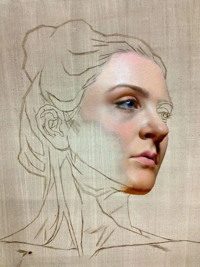
Okay guys, let's talk about this painting,
this alla prima sketch.
As you can see, I've started very loosely
and my goal here is to establish the composition
as soon as possible.
So I'm using just a stain of approximate darks
to create a silhouette of the head
so I can see immediately the placement
of the head on the canvas.
Because sometimes we end up with awkward placement
of the head when we do sketches and it can be painful.
So we have to trim the canvas
or we have to do something else.
So I recommend if you want to work in such loose way
without initial constructive drawing in the beginning,
you just start with a general shape.
And you work inside of this shape
to see how you can manage the likeness
and the illusion of the form.
So when I have the shape of the head established already,
I focus on the actual face.
So as you can see, I focus mostly on the triangles
of the eye sockets, triangular of the nose,
triangular of the shadow, cast shadow from the nose.
Again, triangular shapes of the lips
and the cast shadow in that area.
So you see, the whole composition of the face
is just a bunch of certain triangles.
And such simplification helps a lot in the very beginning,
just to place features, to see the relationships
and also to see how does it work.
So at this stage, we already can see does it work or not.
Are we satisfied with composition
and with the placement of the features
with a general depiction of the face or not?
I'm using mostly the soft brushes here,
just long flats from Rosemary.
And I still paint very, very thinly.
You still can see the initial wash
in certain parts of the face.
And what you can see now on the screen
is just a subtle modeling of the shapes of the forehead.
So generally speaking,
I already see the design of the shapes in my painting.
And now it's time to establish the lips
and also the shadows under the nose
and on the shadow part of the head.
The core shadow is very close to the outline.
So we don't have big shadow shapes.
Mostly, most of the planes are light family values.
And what is really important,
my top priority for the values here
is to have the value of the distant part
of the distant half of the face
be darker than the closest part of the face.
Because if we squint down,
we can see that symmetrical arrangements
of shapes along the center line,
they have different values altogether.
So I recommend you to squint a lot.
And by squinting,
I mean squinting almost to the completely closed eyes.
So if closed eyes are 100%
and open eyes 0%,
the squinting, the good squinting is about 80 to 85%.
For the skin tones,
I mixed the very simple mixture just to start with.
I used transparent red oxide,
titanium white and king's blue
to create some sort of desaturated yellow color.
The most important here is to have it really desaturated.
So we don't really have strong chroma
in the very beginning of our painting.
And if you feel like your mixtures
are not really interesting or they look muddy,
just check the temperatures first.
So just maintain the temperature of the shadow
and the temperature of the light.
They should be separated, like they should be opposite.
So if shadows are warm,
and in our case, they look very brown,
the light has to be cold,
like grayish in our case.
And the second thing for the skin tones
is just to maintain the lights desaturated,
especially in the beginning.
You can always make things look more saturated later
by adding chromatic areas in the transitional mid-tones.
I am still working with big brushes here
because I just want it to be more efficient.
You can work with the smaller rounds if you like.
It's totally fine.
Just keep in mind that all the edges,
better to keep them soft at this stage of the painting.
I've made some decision about edge.
The cast shadow from the nose is going to be my sharpest edge
so I've already placed it there with a sharp edge
so I can refer to it.
And the rest of the edges are going to be very soft.
As you can see on my palette,
I keep the shadows and the lights separated.
I have plenty of space to keep my palette organized.
I don't really need a lot of area
for mixing for this painting.
All I need to have is just some pool of lights
and some pool of shadows
so my mixtures are not going to be contaminated
with each other and it is totally fine.
You can see in the light area I have desaturated base,
more saturated yellow-brown color
and down below we have some kind
of a pinkish-reddish mid-tones.
I recommend you do not worry
about how monochrome painting can look at this stage.
Keep in mind that this is just the beginning.
I think it's about half an hour, maybe 40 minutes of work
and I also recommend you to step away every half an hour.
The best way is just to put the timer.
So every time when time is up,
you just walk away for a couple of minutes and you get back
so you can see all mistakes or small things
which you have to fix or things you didn't notice before
because you've been too occupied with the process.
So when you work from photos,
I recommend you to set a timer to walk away.
Okay, here you can see that I started
to mix some green color because I don't want
to be too predictable with the shadows.
All we need to maintain is just the warmth in the shadows
so I don't want them to look very, very cool.
So no blue primary, just a little bit to create a green
and I do the same now with the lights.
I introduced blue primary in the light areas
so the temperature of the skin tones
is getting cooler towards the light
because the light is cold and I assume,
and also I see it on the photo,
that the skin tones are getting cooler and lighter
in the areas which are most perpendicular
to the light source but at the same time,
I use more red primary in the transitional mid-tones
and also in some dark accents to create vibrancy.
So every time when you see chromatic
or saturated area in the skin tones,
focus on exact placement of saturated part.
In most of the cases, the most chromatic parts
will be transitional half-tones
but not the general light itself.
So if you maintain the difference between the light
and transition from the shadow,
like let's say, for example, in the nose,
transitional half-tone will be red
but the general light shape of the nose
will be more neutral.
The nose will look as it should
without being over-chromatic.
So I'm still using the long flats.
I still feel quite comfortable modeling with them
and they're very soft.
The point of using such brush is
we can work very precisely
but at the same time, very loosely
with the same, with just using one brush.
So using the corner of it
or the blade side of it,
I can work with the small details
and using broad side,
I can feel quickly the big areas of my painting.
And also such brush is very good
for blending on top of the canvas,
like kind of a modeling.
I prefer to work, to consider my work
more like a sculpting with a pigment
instead of drawing.
It is why I try to train myself
to see the form and to depict the form
without initial construction drawing.
Although I highly recommend to draw
and to practice constructive approach.
And also if you feel more comfortable
with initial pencil drawing
before you commit to painting,
it's absolutely nice.
So I highly recommend to do it.
But try to think about three dimensionality of the form.
So here you can see that I apply
more and more thicker paint
at the same areas of light.
So the illusion of the form
is modeling with the value
but also with a different thickness
of the paint applied to the canvas.
By the way, I'm using just a canvas,
stretched canvas here in this painting.
I stretch such canvas on stretcher bars
and if I like the painting,
if painting is successful,
I remove it from stretcher bars
and I glue the canvas to aluminum composite panel.
I'm using Beaver film,
very archival adhesive
to have full control over all materials I use
in creating of art.
More modeling here and yeah,
everything is very obvious.
I just want to show the muzzle of the mouth
and it is very, very important part
because distant part of muzzle of the mouth
should be darker than the nearest part
of the muzzle of the mouth.
But since it is more perpendicular to the light source,
it should be lighter.
So I have to deal with it
and you can see now that I have this illusion
of something protruding from the face
and this is absolutely great
for such areas as mouth and nose.
The highlight in between the nose
and the eye socket is going to be blue
and I already started to place some bluish mixture
over there.
First attempt of the highlight in the nose
and feel free to work this way.
You just apply the light
and if highlight is too strong
or the placement is not really correct,
you can just blend it in and start again.
So if your temperatures and mixture
and your values are correct,
mistakes will not be really severe
and you can just use it as a blending device
like as you can see it now.
Just applying loosely,
more saturated, thicker paint in the area.
I can just blend it in
and if I'm not satisfied,
I can just cover it with something more correct.
But if the temperature is wrong,
let's say if the mixture is cold
but it should be warm,
it is better to revert.
So to erase or to scrape down this area
and to fill it with the proper mixture
because it is very, very difficult
to overlap, to cover the wrong temperature mixture
with a correct one.
They will mix together anyways
because we are dealing with a wet on wet painting.
So Alla Prima has benefits
but it also has some drawbacks
and pitfalls of making skin tones look too muddy.
In the modeling of the features,
the most important is to maintain the soft edges.
Just try to keep the edges softer.
I know it is difficult to keep edges soft
but at the same time to create solid design
of the different planes
but it is crucial for creating believable illusion
of the face or even of the person.
So for this, I just use soft brushes
and I try to do not overdo the value contrast.
So the values, they look pretty much the same
but just a slight difference in the value
or in the temperature can do the job.
Like in modeling of the eye,
I know that the sharpest edge in the eye
is going to be the highlight inside of the eye.
So the rest of the edges are going to be soft.
And another important thing for the eye
is to keep in mind that the upper eyelid
is always casting the shadow on the actual eye into the eye.
And plus we have the eyelashes there.
So this dark accent below the upper eyelid
is utmost important.
And there is also another aspect.
The eyelid can be depicted
with three or four different planes.
And one of the planes is going to be perpendicular
to the light source.
And this plane will be aligned with a highlight
in the iris of the eye.
And also it will be aligned to the highlight
in the lower eyelid.
So try to look for such alignments in the highlights.
It will help you to depict the form faster
and with more effortless look.
So now it is more about the subtle rendering
and subtle blending of the paint.
To be totally clear, I believe at this stage
the sketch is already looking good.
So if you have such a result,
probably it is time to slow down.
If you feel like it is going to be good painting,
do not rush in the end.
Because a la prima can be very tricky.
We can ruin the painting in the very end
and it can be really frustrating.
So slow down, you can always work on it tomorrow
or week after when it is dry.
So you can oil it out and continue
because all we need at this initial a la prima stage
is proper and correct design of the planes,
design of the values and the likeness.
If you have all of these things
and your temperatures and skin tones are okay,
I will consider slowing down.
And let's talk a little bit about the initial stain
I've made in the very few minutes
and the very few first minutes of this sketch.
It is still there in the hair.
So I didn't spend any time on modeling the hair
or designing the hair.
All I had to do is just to create
some cast shadow from the hair
and just darker occlusion shadows inside of it.
So my recommendation is when you see
the big dark mass, big dark shapes,
try to mix them as correct as possible
from the very beginning
and apply them with a broad, loose brush strokes
and ignore them because they will hold the illusion,
they will hold the foundation for your successful painting.
So I hope it was helpful for you, this small tutorial.
And I'm going to upload small tutorials like this next month
along with a patron-only content.
And feel free to share your sketches with me
on Discord or in social medias.
I would really love to see them.
Happy painting, guys, and see you later.
Bye.