In this series "The Masters of Art" I will be reflecting on some of the work of my favorite artists from history. These artists have been an essential point of reference in which I have studied for the betterment my own work. I will be openly sharing my observations of what I have learned from each unique master.
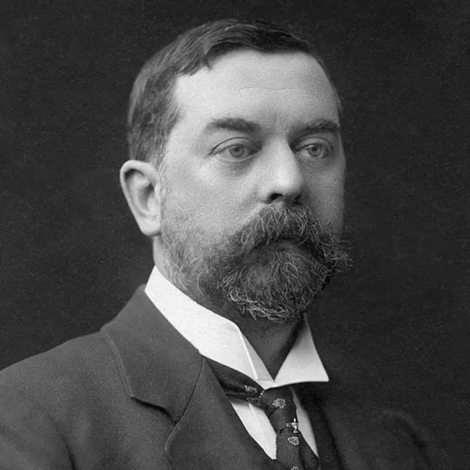
In this video (Episode 1) we will be looking at the works of John Singer Sargent. Sargent was a master of the 19th century... He combined a unique juxtaposition of Realism and Impressionism to form some of the most iconic works of the era.
My name is Alex Hess and I am a professional artist that focuses my craft towards Realism. I believe my paintings take a rather signature approach in the fact that very few Realism artists paint using Acrylics. If you like this content continue to join me by SUBSCRIBING to this channel. Thank you.
For more of my work: alex-hess.com
Find me on social media @alexhess_artist
In this video, we're going to be looking at one of my all-time favorite artists,
and also one of the most influential. That is the famed 19th century American artist,
John Singer Sargent. Stick around to the end if you want to see an in-depth analysis of what I
think made Sargent a master. Welcome to episode number one of the series, The Masters of Art.
My name is Alex Hess, and in this episode, we're going to be looking at one of my all-time
favorites. That is the American 19th century artist, John Singer Sargent.
The goal of this series is for me to just openly share and reflect on artists of history that I've
found to be extremely influential and beneficial to my own work. And as always, if you like this
type of content, out of all the social networks, I tend to post most regularly on Instagram,
and feel free to give me a follow. It's always appreciated.
Now, how these episodes are going to work in this video and in the future,
so I'll give a quick introduction like this, and then I've put together a nice,
in-depth analysis of some of my favorite works of Sargent. So with that being said,
let's jump right into this and start looking at John Singer Sargent.
All right, so starting, John Singer Sargent was born January 12th, 1856, and he died April 14th,
1925. And a short bio about Sargent before we start. John Singer Sargent was an American
realism artist, considering the leading portrait painter of his generation. For his evocations on
Edwardian era luxury, he created roughly 900 oil paintings and more than 2,000 watercolors,
as well as countless sketches and charcoal drawings. All right, so the first painting
we're going to be looking at is probably his most controversial and possibly his most famous.
That is the portrait of Madame X, which as you can see, it's actually a pretty big painting.
Images don't quite do it justice. This painting is seven feet, eight inches by three feet and
seven inches, which is a pretty big painting to say the least. And on first glance, I remember the
first time I saw this painting, I was actually in New York City at the Met, and I was just
completely floored because with the extremely pale flesh tone and then the deep background,
it almost sets instant focus to the triangular composition found within this painting.
And something interesting, Madame X was painted not as a commission, but at the request of Sargent
himself. And a little backstory on this piece, particularly because it caused so much uproar, was
when he debuted this piece at the Paris Salon in 1884, the critics lashed out the artist for
what they deemed to be a scandalous and immoral image. And this was all because the left strap
of Madame X was hanging down below her shoulder. And after this, Salon Sargent took the painting
back to his studio and then didn't display it for 30 years until he sold it to the Met.
So starting now on this first slide, I think it fantastically shows how everything of Sargent
is kind of captured in this one image. So you have some abstraction like in the ear and then
on the straps, but then you have the super tight and refined realism on the flesh itself.
And I also love, because you can see this in Sargent's charcoal drawings even,
he almost creates a strap line around the figure or the composition. As you can see
on the left arm up through the neck, it gets super dark around the edges and it almost gives
the illusion as she's like, she's curving back into the background. And I also love looking at
this, just how tight the silhouette of her face is rendered. It's just like every little curve
and every little mark of her face is all there. And on the next one, this is an up close of the
chest and the most controversial part of the image. And I think it wonderfully shows how
abstract and loosely he painted those straps. And even though it's just kind of stroke marks,
and if you blur your eye, it almost just, it's pretty abstract, but all the values correct,
and it reads perfectly as this glamorous strap on the dress. And now this up close, I think,
perfectly shows Sargent's almost fencing like attack onto the canvas. If you look at
how tight spots in this painting are rendered, but then look at that edge of that table,
he basically just took the brush and just whipped it across. Like that's really the only
way you can get that very abstract choppy stroke like that. And he was known for doing that in a
lot of his paintings. And now looking at the hand in more detail, it's interesting to maybe Sargent,
you can tell that he really cherished this painting when he was making it because
a lot of his hands he treated extremely abstractly. I mean, sometimes if you were to just zoom into
the hands, it would be hard to tell even what it was. But on Madame X, the hand is very carefully
painted. And, but yet you still see a bit of Sargent like on the ring. It's not a perfectly
sharp wedding ring. It's just a little highlight and it reads perfectly when zoomed out as a
wedding ring. And now on to the next one. This, I think, is one of Sargent's true masterpieces. And
it's Carnation Lily, Lily Rose. And this is also a pretty big painting. It's five feet, nine inches
by five feet, one inch. And this is housed at the Tate in Britain. And this painting is a fantastic
example of where Sargent gets classified with impressionism sometime and realism on another time.
Because as you can see with the floral and the grass and everything, it's very loose. It almost,
it almost has the feeling of like a Monet or something, which whom Sargent was actually
close with. And this is an example of Sargent's plein air painting, which I think is
incredibly impressive that he was able to pull this off at twilight, just painting from life.
And now zooming up on the two central figures, I think just looking at this painting, it's just
almost perfect. I mean, the level of saturation in the lanterns and then how tightly some spots
are painted and how loosely other spots are painted. I think it's just a fantastic example
of Sargent at his best. And with the grass zoomed up into it, you can almost see what Sargent was
known for was that very bravado stroke. And I think this grass shows that better than almost
anything else. I think each one of those strokes, he was probably standing back feet away from the
canvas and just slashing, slashing paint on there pretty much. And with enough layering, you start
getting that illusion and texture of grass itself. And I wanted to zoom up on the flowers in this
painting because I kept thinking I wasn't really sure exactly what that reminded me of. Then I
thought about, and it's very Klimt or Mucha, something Nouveau-esque. The way the flowers are
shaped and how simplified the edges are totally, totally reminded me of some of the Nouveau.
And now onto the next painting of Sargent in the Luxembourg Gardens. And I've actually seen this
painting in person. It's at the Philadelphia Museum of Art. And it's not an extremely big
painting by Sargent, but it's just, it has everything going for it. Just looking at it at
first glance, he's taking this huge scene, which you would almost have to capture on an extremely
wide angled camera. I mean, if you think about this as a scene, and it's just amazing to me how
abstractly and loosely he paints a scene of this size. Like as you can see, just looking at it at
first glance, how loose the background is and even into the foreground, but it all reads as
realism. And it's totally convincing that this would have been sometime around sunset or twilight.
And now looking at the main figures up close, I think it's just great seeing how loosely Sargent
just kind of threw that paint on. And I mean, really, if there's one thing to take away from
this presentation is Sargent was king with abstraction and loose brushwork. And you can
see it all throughout this, from the man sitting on the left, to the figures in the foreground,
to the figures in the background, it's all there. And then this crop of just the background, I think
it just screams Sargent, in my opinion, that very loose a la Prima style painting,
which means he's painting wet on wet. And that that's something Sargent commonly did. And you
can see it because it's, it's very at the moment. I think he probably painted pretty quickly
and he wasn't too concerned about blending. He just got the colors in and kept moving.
And I love looking when you see Sargent's in person, seeing some of the impasto, which I can
tell because I've seen this painting, that sun was totally intentional. When you start building
highlights up like that on impasto, it actually gives more effect of dimensionality. And now on
to the next one, which is, I think my favorite painting of all time from Sargent, and that's
Lady Agnew of Loch Noth. And this painting is currently in Scotland. And I just think it's
Sargent's finest example of any of his portraits, because on first glance, you just you get
everything that I personally love about Sargent, that tight realism on the portrait, and that
super abstract brushwork all throughout the dress, the drapery, and the chair itself.
And looking close up, you can see just how tight that the rendering of the faces. I mean, it's
in some sense, I think Sargent is up there with the best realism artists because it just,
the colors are perfectly accurate. The highlights are exactly right. And something that I've
learned with Sargent is that the contrast from abstraction to tight realism, I think that's,
I think that's what made Sargent one of the all-time best artists throughout history.
And with this up close of the dress itself, again, with the abstraction and some of the impasto-esque,
and when I say impasto, I mean a built-up layer of paint. Someone to think about with impasto
would be someone like Van Gogh. But as you can see on some of the highlights and some of the
shadows and everything, and even on the arm off to the right, it's just as beautiful abstraction,
somewhat roughly painted. But I think that's a key takeaway is value is everything. The rendering
is secondary because no matter how tight or loose you paint the subject, if your values are correct,
it reads perfectly, especially from a distance. And I had to do an up close zoom on that pattern
fabric because it's so different than what I think some people might think first looking at the
painting. Like if I were to just crop this painting just on this slide, this could pass for a,
I mean, an impressionist abstract work. It's, it's very loose. It's almost loose to the point
where it just becomes a bunch of strokes. But again, from a distance, it reads as a pattern
and it's just beautifully rendered. And lastly, for this piece was the necklace that, it just
gleams on the actual final portrait. But as you can see, like the strap of Madame X, it's not
overly tight. There's, there's some good detail in there, but it's nothing like what you would find on
some of the Renaissance or Baroque artists. Sargent is taking liberty much more in line of
just quickly abstract, simplistic breakdown of form. And now onto the portrait of Carlos Duran.
I think this portrait is one of Sargent's, or one of my favorites from Sargent. And
this painting, surprisingly, Sargent was only 23 years old when he painted this, which this was
actually his instructor. He was actually at Duran's atelier between 1874 to 1877.
So this painting was, in my estimations, a homage to a teacher that he clearly felt was influential
and helped guide him on a way. And once again, getting up close into the portrait, you see just
how tightly the flesh is rendered. I mean, it's up there with some of the best. It's up there with
a Bouguereau or some of the other great realism artists. But then you look down to the bottom
right and see that loose brushwork on the jacket and into the shirt. And it's just, it's a perfect
juxtaposition. And with this next one, again, an up close of where you can see even 23-year-old
Sargent come to life. It's that impressionistic abstraction throughout this jacket. And this is
a perfect example of that. And I think this is a good example of Sargent's hands that he was
kind of known for. When you look at that, it doesn't, it doesn't look right. It doesn't look
like a hand that is perfectly defined where you see the calluses and the creases on the fingers.
But once again, it's all there. From a distance, it reads perfectly because values are spot on.
And if you look at the ring finger, if you remember the Madame X, it's almost the exact
same thing. The wedding ring that he has on, it's nothing but a highlight. That's the only thing
that's forming the idea of a ring. So he was just a master of keeping it loose, simple, and getting
accurate values. And this last thing, I thought this was great because Sargent, he does this on
a lot of his paintings. He'll write little inscriptions or he'll sign it at the top of the
painting. And sometimes he'll write things such as this on it. And as you can see, the painting
was signed John S. Sargent, 1879. And this next painting I had to put in because it's here in
Pittsburgh at the Carnegie Museum of Art, which I've seen this painting countless times and it's
just fantastic every time. And it's titled Venetian Interior. It's not a very big painting.
It's roughly what, 30 inches by 14 inches, I believe. And it's just a great example of
when people think of realism, they tend to think of super saturated, bright, vivid colors.
But when you analyze the works of Sargent, especially in person, it's all muted. It's
very muted tones. It's very grayed down. And that's actually a great thing to do because
then when you get that hint of vibrancy, it just jumps right off. Like you notice it right away
with when you contrast some of those muted colors with the more vivid, it has that perfect emphasis.
And now looking zoomed in, this is not an easy thing to do with painting. It's when you're
painting in almost a shadow scene because the colors get a lot more confusing. And in my opinion,
a lot harder to read, especially in the shadows and the way he's handling the window lit figures
on the right to the central figures on the left. It's just, once again, it's look how loose it is,
but it just reads perfectly, especially from a distance. And now zooming into the figures
in the back, as you can see it, I mean, you can almost count the strokes on the middle one.
Sargent definitely did not overthink detail. Like if you look at Raphael or Caravaggio or something,
you see every little strand of lace and every little detail. But when looking at the works
of Sargent, there's none of that. There's no super tight blending on aspects like this. It's just
loose. And I think he's painting in a distance and just getting those colors in. And this is
probably my favorite part of the entire painting. It's one of the most simplistic, but clearly this
was a very bright light shining through a window. So it was almost being concentrated
right on the floor. And even according to the Washington Post, which I think that's a great
quote, they says this painting contains what is possibly the most beautiful brush stroke in the
history of art, which to be honest, if you see it in person, you get that exact same impression
because the way that he had to have painted this was he literally loaded up his brush
and just slashed it right into the canvas. And it's just it reads perfectly as light
shining through a window. And it's just one of Sargent's best examples.
And I've shown a bunch of figures and portraits. So I wanted to show something Sargent personally
was passionate about. And that was the more landscape and plein air-esque painting.
And this painting, I think, is one of his best examples of landscapes. And he did this plein air
at Lake O'Hara, which is in British Columbia in Canada. And just looking at this, you get this
huge scene, like it's a masterfully done landscape. And yet it has all the things
that make Sargent, Sargent. It has the tightness. It has the looseness. It's all there. And the
saturation, which on this slide perfectly shows, look how bright and vivid those colors were that
Sargent was able to get, which I've looked into Sargent quite a bit. And it's amazing because he
used a pretty involved palette, but his palette was a complete chaos. It was colors everywhere.
And yet somehow he was able to achieve just fantastic saturation and vividness throughout
his entire paintings. And now really zoomed in at that snowscape on the top left. Again,
it's all there. You have the saturation and the shadows, which he didn't keep muted.
And yet you have some of that blending and tightness and the abstraction. And it's just,
again, great example. And even on the foreground, which I found to be interesting, it looks like
in the bottom central spot of it, it looks like it could have been a campfire or something like
that. It looks like firewood or a little pit right there. And I think that's, I think this
just beautifully shows Sargent at his best once again. And it's just how loose it's and quickly
it's painted. And it's amazing because when you look at the whole painting again, it reads
perfectly. But then when you get up to it, there's these thick bravado strokes that
basically just scream quickly, fastly rendered, a lot of paint, fast motion. And I just, I think
Sargent was a master at everything he did from portraiture to landscape to you name it. And
lastly, I had to put this in because Sargent's sketches specifically, in my opinion, his charcoal
portraits are just, they're just perfect. I mean, it's like, I look at those and I don't know how
long it took him to do those, but I'm assuming he was probably able to churn these out in one sitting,
I would suspect. And I just love the, the trap lines and some of the hatching and in a weird
way, it even, it even reminds me a little of J.C. Leindecker's work on some of his sketches,
especially on some of the trap lines and everything. But I mean, it's amazing to think
Sargent produced more than 750 charcoal portraits of public figures, patrons, and friends. And right
now on this slide, I'm only showing about five. And that pretty much concludes this slideshow.
Hopefully you enjoyed it and look into Sargent yourself. He's one of the best.
Well, that pretty much concludes the presentation of John Singer Sargent. However, before this video
stops, I wanted to share my master study of Sargent's Madame X, which I shared in this
presentation. I created this study probably about a year ago, and it's obviously quite a bit smaller
than the actual one that hangs at the Met. But by creating the study, I was able to really dive
into this painting and really figure out what made this such a masterpiece. I was able to
loosen up my strokes and get some of that more bravado brushwork that Sargent was famous for.
And hopefully you found this video to be beneficial. And if you did, don't forget to
like and subscribe to this channel. As an artist, that really motivates me to keep creating content
for YouTube. And until the next video, I hope to see you there and goodbye.