
OIL PAINTING TIPS || The Mind of an Artist #4
Alright, welcome back friends. So, in today's video I would like to talk about how I paint
faces and skin tones and also why I do it the way I do, but maybe even more importantly what we can
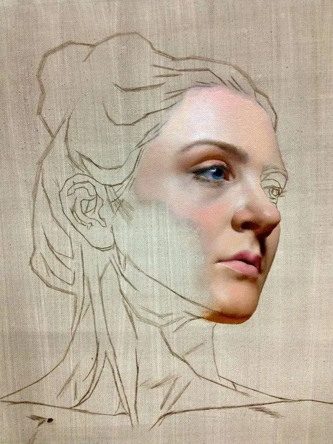
take away from it. So, I start this painting by carefully painting the most important parts of
the face in such a way that I don't end up with any surprises later in the painting process.
I really don't want to be concerned with correcting proportions in the middle of the process.
I want to focus all my energy on creating a particular look and feel.
That's also the reason I start out with a charcoal transfer. This allows me to
concentrate on the painting portion, rather than having to be concerned with error correction.
I'm using a small ready-to-paint on canvas panel for this painting. The kind that you can get at
pretty much any art store. But to be honest, it doesn't really matter that much this time.
For this painting I don't necessarily need a particular surface to create all the effects
that I want. So, I went with what I had laying around in the studio. And since I have a bunch
of these panels and I also like to keep things simple, it's the perfect painting surface for
this painting. I'm using a mixture of simple flat and small round brushes. The small round
brushes come in quite handy early in the painting process when I need maximum control. But they're
also pretty much a must to paint some of the smaller details of the face. The oil paints that
I'm using are as usual from Saunelier, Rembrandt and Old Holland. But later in the painting process
I also use one very special color from Schmincke's Mussini line, which is crucial for the background.
But more on that later. And last but not least, as a painting medium I'm using Gal Kit.
Now, to be honest, the only reason I'm using it for this painting is simply that I didn't
have anything else available at the time. I sometimes add it to my own mediums to speed
up drying times, but apart from that it's not something I tend to use on its own.
Unlike Liquin, it doesn't change the colors too much, but the consistency is horrible. And
depending on how much you use, the way the paint dries can be dramatically different,
which can leave you with a painting surface that has glossy patches all over it. So normally I
would have preferred something else, but it's also not that important to be honest. You can
make anything work if you want to. So I start the painting by painting the darkest parts first,
starting with the eyes, the lips and the nose. After putting all those into place,
I go right back into painting the eyes, which are unquestionably the most important part of
this particular face. So that's also where my focus is at the beginning of the painting process.
I want to make sure that I capture the expression, which is not only central for the whole feel of
the painting, but also what inspired me in the first place. The model's look and expression
kind of gave off an 80s poster illustration vibe to me, and it also reminded me a bit of
Drew Strusen's work. So I guess that's also the reason why the finished painting does indeed end
up feeling a bit 80s. So although I start the painting by moving from one part to the next,
what I'm not doing here is completely finishing an area before I go on to the next. Even though
I don't necessarily want this painting to look overly realistic, I still always try to emulate
the effects that you see in real life. Skin, for example, isn't a smooth surface. It has textures
and all kinds of imperfections. And creating textures and imperfections is something that
you can't really do if you just paint one layer. It's not impossible, but even if you pull it off,
you're likely sacrificing something in return. If you paint something a la prima, meaning in
one layer, you can usually work by putting patches of paint next to each other or by
painting gradients. And the latter generally tends to look off, especially the more realistic
you try to paint the face. It makes faces and skin tones look waxy and unnatural. It's the
uncanny valley of oil painting. You often end up with faces that kind of look realistic, but at the
same time alien, and something doesn't feel right about them. If you build up a painting in layers,
on the other hand, many of the things that give life and vibrancy to a painting happen naturally.
When you create layers, you also create imperfections in color and texture, which in
return reflect the sunlight differently, making for a much more realistic surface that's closer
to real life, especially when painting skin. So as I move on to fill out the rest of the face by
putting color next to color, I want you to notice how exaggerated the temperature differences are.
And by that, I mean how cool or warm some areas look compared to others. And that again is
something that I do in order to create a much more vibrant and interesting representation of skin.
Skin doesn't have a particular color. In this case, it's pretty much just a collection of warm
and cool grays. So in order to capture this fact about reality, what I tend to do is exaggerate it.
Whenever I'm mixing a color, the first question I'm asking myself isn't which color it is,
but if it's cool or warm. Focusing more on this during the process gives the skin vibrancy and
an almost shimmering quality, especially when I start to put more layers on top. And what you
ultimately end up with is something far more interesting and pleasing to the eye than if you
just focus on color alone. So after filling out the face and the hair, I call it a day and I wait
for everything to dry before I go back to rework the painting. At the beginning of the second
painting session, I go back to rework the eyes. Right off the bat, I want to make sure that the
most important part of the face is exactly how I want it to be. The eyes have to be intriguing
and the gaze has to be convincing in order for the painting to work. After that, I go on to put
another layer of skin tones on top of what I already established and make sure to only paint
what I really need. You don't want to paint over everything you already created. You only want to
tweak it and make corrections when necessary. Doing that allows for the layers underneath
to shine through, creating the effect that I described earlier. I also don't paint everything
to an equal finish. I don't want the less important parts of the face to compete for the
viewer's attention. This is again something that's inspired by effects in the real world and one of
the things that make for a more interesting visual experience. The human eye can't focus on
everything at the same time. We have a limited field of focus and also a limited field of vision.
So I'm considering that fact and I'm directing the viewer's attention right where I want it to be.
So what I do next is something that goes back to the idea of contrasting. I paint a reddish halo
around the face and the hair and the reason why I'm doing that is because I already decided for
the painting to have a cool background color. And what I want to do is mirror the interplay
of cool and warm skin colors in the background. I paint a red halo knowing that when I start to
paint the background some of it will show through in the end, making for a nice vibrant contrast.
And that brings us to the background, the pièce de résistance. Remember the special color I
mentioned at the beginning of the video? Well, this is what I needed it for. The mighty cobalt turquoise.
Cobalt turquoise is an incredibly brilliant color that has also quite the incredible tinting
strength. Meaning that even the tiniest amount can change a whole tube of white oil paint into
a bright turquoise. I actually use it a lot in my paintings. Whenever you see any turquoise in my
paintings you can pretty much be sure that it's cobalt turquoise. You can even see it in the
painting in the background. Which by the way is a huge and I mean really huge painting of a giant
gundam that I will hopefully find the time to finish sometime this year. But used in moderation
some of these more exotic pigments can create beautifully bright yet incredibly intense colors
that are totally different from the gray and pale colors you usually end up with when you try to mix
a bright color that has white mixed into it. And since it is not just any oil paint but one that
has resin mixed into it I also end up with a beautiful even finish that not only contrasts
but also complements the face that I painted. So after painting the background and introducing some
abstractions and textures to the painting all that's left for me to do is to make some corrections
here and there until I feel that I found the right balance between all the components that make up
the painting. There are many different ways to approach a painting but in my experience the
worst ways always have two things in common. Biases and expectations. The secret to making anything
in a painting work lies in breaking out of the norms. Just painting what you see will also only
get you what you see. And that's in the best case. So at some point in the process you have to free
yourself from the reference material and from all the things you think you know and want. All those
little biases and expectations. If your only goal is to paint skin as close to reality as possible
chances are you will end up with something incredibly dull and boring. Reality can be boring.
It often is. That's one of the reasons why we have books and movies and games that are only based on
reality and not a copy or description of it. I mean can you imagine playing Super Mario but instead
of jumping through worlds fighting enemies and rescuing princesses you're just a regular plumber
going to work? Well me neither. So why would you want that for your painting? But with that being
said guys we're gonna bring this video to an end. Thank you all so much for watching. Please hit like,
subscribe if you're not already a subscriber and yeah have a good one.