
Glazing : Oil painting techniques - step by step demonstration
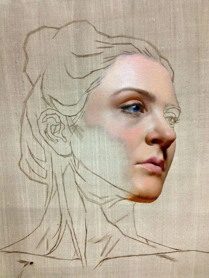
1 Video View·May 9, 2026
AI GeneratedMay contain errors
Hi everyone, my name is Florent Farge and in this video I finally get to talk about a subject that
a lot of people want to hear about, talking about glazing. In the history of art glazing
is a very important technique. It appeared soon after the introduction of oil painting
and for the first time in art the artists were able to play with transparency and take advantage
of all its visual possibilities. Somehow I think that it was overused at a time in the history of
art and it became sort of old-fashioned after a while. So today we could say that glazing is
sort of old school but it doesn't mean that we should not take a look at this and see if we can
make something beautiful out of it. So what are we talking about first of all? Glazing is applying a
transparent or semi-transparent layer of paint over another thoroughly dried layer of paint.
The dried layer is then called underpainting or first painting and the glazes can stack up
for many layers creating the second, third, fourth painting and so on. Due to the effect of transparency
glazing has a visual depth that is almost impossible to obtain otherwise. It also seems
that the objects made by glazing are a little bit more eye-catching. You have to keep that in mind
because you don't want to let it go out of control. So where does this impression of depth come from?
Well the effect is comparable to what happens when you use glossy varnish on your painting.
It is due to the reflective properties of the surface. So let's look at an opaque painted surface
with a matte finish. As you can see here when the light hits the surface it is scattered or
diffused in every direction and because of that the image appears slightly hazy. The visual
information received by the viewer's eye is all over the place so the colors don't look very intense.
It is especially visible for the darkest colors. The only advantage of a matte surface is to
reduce glare but at the cost of color intensity. Now let's take a look at the same surface coated
with a glossy layer of oil. Because the top layer is transparent when the light hits the surface
it splits into a part that is refracted through the transparent medium and another part that
is reflected creating a specular reflection. This is where the annoying glare that oil painters
often struggle with comes from. The rest of the light continues its path through the transparent
medium and hits the pigment. Because of the nature of the transparent coating surface
the reflected light is much more directional than in the first example. The light doesn't scatter
as much and the information received by the viewer's eye is much more descriptive. This is why
a glossy surface creates more intense colors and this is crucially true with the darkest colors.
Of course you have to be aware that these two examples are not entirely correct because a
painting is a complex object that exhibits both types of reflections at the same time. Anyway,
what matters is that you understand that glossy surfaces create more intense color impression.
Now in the case of a glaze you have to create a layer with very little pigments
in a transparent medium creating the same kind of glossy surface. This is why glazing is known
for being able to create deep and intense colors when used well. In some way it is comparable to
spreading a transparent layer of oil or varnish on a painting but with the addition of transparent
pigments that let the light go through. In the end you have both the effect of color intensity
plus the benefits of optical color mixing. And let's talk about that. Although it has the advantage
of being able to create pretty unique colors, the downside of glazing is that the colors that
result from it can never be predicted with great accuracy. Why is it so hard? In the case of a
physical color mixing the biggest part of the light bounces around the medium and gets out as
the resulting mixed color. At the same time another part of the color impression is also the effect
of our brain interpreting blue and yellow pigments next to each other as green just as in pointillism.
So as you can see physical mixing of colors is already pretty complex but the easy thing is that
you get what you see. You just try this on your palette and you know that this is what you will
see on your painting. Pretty simple. In the case of a glaze colors mix just like if someone placed
a colored filter on top of an object from another color. The light goes through the layers resulting
in a mix of the two. But it is not easy to predict the exact color that you might get in the end
because every pigment can react differently to the light or be more or less transparent. In fact
because no paint can be perfectly transparent you will most of the time get a side effect of glazing.
Some of the light will scatter on the top layer and not go through both layers. It will bounce
back to your eye and your brain will still only see the green but feel the strong blue element
of the mix at the same time. This is important because it means that most of the time blue glazed
over yellow will not feel the same as yellow glazed over blue. This is the promise of infinite
color mixing possibilities but at the same time can be pretty confusing if you don't have the
right strategies. The material needed for glazing is pretty simple. A few hot bristle brushes and
stables should be enough. You want to brush with good bristle retention because it's very important
that you control the quantity of pigment that you apply. Glazing is not about applying a big
quantity of oil but rather about laying down a small quantity of pigments. With glazing it is
crucial to keep things under control so it's probably best to get good quality natural brushes.
There is no special medium dedicated to glazing. I suggest you use the same medium you use for the
rest of your painting and don't go buy expensive special glazing medium as they're not any better
than any medium you can make yourself. I think that many people focus way too much on the magic
of the medium so to say especially for glazing. People often talk about old masters of the
renaissance who would use some secret medium recipe for glazing. Maybe but they were not
successful thanks to their medium but rather thanks to the ways they used it. As long as your
medium is transparent you can use it for glazing. And regarding medium keep in mind that you should
follow the fat over lean rule and that your glaze layer is just like any other layer of paint.
I think that the most important thing to remember is that you don't have to drown your pigments
in medium. In fact very little medium is needed. Glazing is just about applying a small quantity
pigments on the canvas. The medium just gives a better flow but that's it. A glaze is not supposed
to be super fat contrary to what some people might think. For glazing you want paint with
either transparent or semi-transparent pigments. Refer to the label on paint tubes. For every opaque
pigments that I have I try to find a similar transparent color. There's a great choice of
transparent pigments and lakes to suit every painter's need. Here's a glazing palette to give
you an idea. Ultramarine blue, burnt carmine, alizarin crimson or quinacridone or permanent
alizarin, transparent red, transparent burnt umber or transparent brown and yes you can glaze with
dark transparent colors. It's actually pretty useful. Transparent burnt sienna, yellow lake,
sap green and finally titanium zinc white. About white, you should know that there is no white for
glazing because by nature white negates the transparency of a glaze. Even zinc white,
the most transparent of all the whites, is not suited for glazing. As far as pure glazing goes,
you should avoid white. Just know that some whites are more transparent than others, zinc white being
the most transparent but not very reliable by itself and titanium white being the most opaque.
So as I said before, the most important thing about glazing is to keep it under control.
To help with this, I try to make an essential difference between two types of glazing which
have different uses. The first type is what I call chromatic glazing and the second one
is what I call transition glazing. I will try to demonstrate those with this sketch that I made for
the purpose of this demonstration. Because glazing is usually something that can be very subtle,
it was hard for me to get footage on one of my actual paintings so I made this little study to
make it easier to play around with glazing. Keep in mind that I will deliberately exaggerate things
and that normally I would be a lot more careful and subtle. But anyway, this sketch will be great
to experiment and see the possibilities of glazing. I've painted this underpainting with
a very limited palette of only burnt sienna, burnt umber, ivory black and titanium white.
I have let this painting dry and now it's ready to be glazed. So let's start. Let's have a look
at the first type of glazing, chromatic glazing. I glazed this fabric with french ultramarine blue.
I start with a hot bristle brush to control the quantity of paint.
I roughly scrub the paint to get the desired thickness and transparency first.
When this is done, I go over it with a much smoother red sable to make it more even. If
you want to make your color more intense, you can still apply more pigment. So as you can see,
the key is to control the quantity of pigment. And it was a very popular technique during the
when the pigments were very expensive to find and transform. Thanks to glazing, artists were
able to paint their first layer using inexpensive paint at first and then add the expensive colors
as a glaze. Furthermore, it was possible for the old masters to create some unique colors
that were not yet discovered back then. Don't forget that the great variety of pigments that
we know today do not always exist. If you think that it is too intense, you can always take a
piece of paper towel and remove some of it. Okay, let's say that this blue is not what you wanted.
You can always take it off and start from scratch. You just remove the ultramarine blue and glaze
with another color. To let you see what happens when you glaze with two colors at the same time,
I'll now add some yellow lake in the fresh sap green. As you can see, you can still modify the
color of a glaze after it's been laid down. Also, it's very important that you don't just
lay down your color, but take the time to control the edges and check if your values are still
correct. You can't just glaze and consider that you're done. You should always check your values
after glazing. And there's a nice trick that I want to show you. If you want to recreate the
effect of shadows while glazing, you can use a transparent complementary. Here, the complementary
to this yellow green is some sort of magenta, like this burnt carbon. As you can see, when applied
over the green, it makes it more gray and also darker. You can use this trick to reinforce the
shadows. In my opinion, you should keep this technique for artificial objects as it is not
easy to be accurate with it, especially if you want to paint skin tone for instance.
For finer work and features of the human body, there's another type of glazing that I call
transition glazing. This technique doesn't use glazing all over the canvas, but just where
transitions and edges need to be improved. Using this approach, you don't use glazing as you would
with a chromatic glaze. It's a lot less intense in terms of color and usually it complements the
construction of the form pretty well. This is the type of glazing that was made famous by da Vinci
in the film Atom. To show you that you can't just glaze the same way you do for a chromatic glazing,
I'll try to do a chromatic glazing just as I did in the last step.
If I glaze over these lips, with a full color for instance, it is way too strong.
So what's the solution? How can you control it? Well, you need to have the right strategies.
Actually, there are three solutions. The first solution is to mix your transparent glazing color
with some opaque neutral color. This will make the glaze a little bit less chromatic
and allow you to create more realistic effects. You keep some of the transparency of the glaze,
but you also keep the control over your color. My advice if you want to glaze is to always have
some opaque colors ready to counteract the effects of glazing. It's good to know how to
use a powerful technique, but it's more important to know how to neutralize it if necessary.
The second solution is to use some kind of transparent brown for glazing,
and brush it off with a clean dry brush. Here as you can see, I applied too much color,
so I can just spread it off by scrubbing with my clean bristle brush.
It's important that this is hard bristle and that it's clean and dry.
The last solution is to use very little paint every time, but to make many glazing layers.
A careful examinations of the work of artists like da Vinci or Titian revealed that they could
use up to several tens of successive glazes to perfect the blurry effect that they were looking
for. This technique is particularly useful to make the forms blend into each other and correct
the inaccuracies of the first paint. As an oil painter, you can see glazing in two different
ways. You can see glazing as a structural part of your painting, which means that you don't make
another painting with full colors, but only a monochromatic painting in black and white or
grisaille, and rely on glazing to bring colors later on. Without glazing, your painting could
not exist. But you can also see glazing just as another tool to add to your repertoire. In that
case, you paint the end of the painting with a full range of color and use glazing for retouching
and refining if necessary. That means that if you get exactly what you want on your first painting,
you might just not use glazing at all. Personally, I don't like to rely too much on glazing,
and in my opinion, it should not be a structural part of my painting.
I don't really feel that glazing is necessary in any of my paintings. I just consider that it's
another tool to add to my repertoire, and I use it only if I need it. You should not rely on glazing
to correct the color. If you see something that needs to be changed in your first painting,
you should do it right away, and not wait for a glazing later.
Glazing has the advantage of preserving the texture of the painting and the brushstrokes,
but be careful, too much of it can kill the vitality of the brushwork.
And finally, the most important, glazing is only as good as your underpainting is.
Painting a good underpainting with accurate values is more important than glazing. Always
remember that a glaze can't correct the mistakes of the underpainting, because it doesn't have
enough value. Alright, I hope this video was helpful to you. If it was, please consider
subscribing and leaving a like, all support is greatly appreciated and really helps me a lot.
As always, have fun painting. Bye!