
Paint the Byzantine Icon of an Angel.
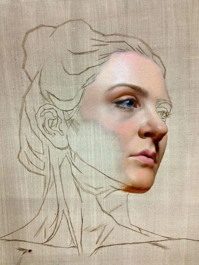
1 Video View·Feb 18, 2025
Hi, my name is Antonis and I am the iconographer of this video.
Firstly, I would like to thank each and every one of you for your support.
It really means a lot to me and it gives me the strength to continue and make more of these videos
and it's really amazing to see that people are interested in what I do, the way I paint
and to the Byzantine iconography in general. More videos are about to come so
again thank you for your support and it's always amazing to me.
Here you can see me painting an angel. For this angel I see the icon of the angel painted by
iconographer Theophanis the Cretan. This icon is in the Protato Monastery in Mount Athos.
Angel Gabriel is an amazing icon of Theophanis and it's not the first time I paint this icon.
I painted it many many years ago. I believe I was in high school like maybe 16 years old
and I remember I was very thrilled when I finished that icon. Of course today when I see it
it has its issues but by that time I was very excited that I had painted such an icon.
This happens to every iconographer. We are always very excited about
what we have accomplished, what we have painted. This is very nice to feel great about what we
paint but sometimes iconographers are overexcited and overenthusiastic. They believe they are
accomplished in every way as iconographers and each time they paint something they
paint it worse and worse instead of becoming better iconographers. That is because at some
point they stop observing the older icons and they paint what they think is right.
Creativity and imagination is great but we should follow the conventions of the Byzantine
iconography I think and when we really have mastered these conventions we should try and
see if we can do something completely creative and new. Here you can see me painting
Angel Gabriel. I have already painted the first photos using ochre, white, titanium white and
some red. This first light should be transparent and liquid. I still learn when I do these studies
and I think I should have painted the first photos in an even more transparent
coat. Anyway, so after this first photos I now paint
with a middle tone between the first light and the proplosmos. Proplosmos is the green-brownish
color that is the base on the face. So I take some of that color and I take some of my first
light and I mix these two colors and then I apply it on the edge of the first photos
to make it smoother and to make the transition smoother. Some people say this is the hardest
process when you paint a face but if you paint the first photos correct then
it shouldn't be as hard to make the transition. Now I make it even smoother
by adding some of my first photos to that transitional color.
Of course the brush is extremely important. You shouldn't use a synthetic brush when you
paint the head. So with that second transitional color I make it even smoother. I don't care how
the first photo looks at this point as again I will go over it a second time
after this second transitional color. Here you can see me painting again
with that first photos and making the transition even smoother.
This first photos should be more on the red side of the spectrum.
Some iconographers painted more yellowish or more like ochre. I think it should be a pinkish
white color, very transparent. It should allow the proplosmos
to be visible underneath. So even in this
icon I have, I think, overdone the opacity of the first photos.
Anyway, so again with the first photos I try to see where the psymetries will go and
paint a little bit like a psymetria style. Always the first photos.
The first photos is, in my opinion, the most important
light because you set the shapes of the areas of a face that is lit.
If you paint the first photos in a nice, liquid, correct way then half of the work is done.
So give some attention, some love to the first photos when you paint it and
your icon will look fantastic.
So now I'm painting the second photos. This second photos is already in the style of
psymetries. That is, I do not blend the color at this point. I just paint the second photos
as psymetries. That is, just lines, one next to the other, decisive and
more white than the first photos. I have added titanium white to my first photos.
Try to practice painting lines on a piece of paper.
Psymetries should be strong, decisive lines but also very fine, very delicate and
very well shaped. So after this second photos I will again smoothen the lines with
a more liquid, half first photos, half second photos. A liquid tone and I will pass smoothly
the areas in between the first and the second photos.
Each and every brush stroke should have a reason to exist. Do not just take the brush and randomly
paint without knowing what your brush consists of. You should always
know what you paint with. And here I paint some very very thinly
coated color. It's pure red, cadmium red, but very very thinned down.
It's extremely transparent and I very gently pass with my brush on some areas like the cheek.
It makes the face more vivid and gives some
and the third photos. You should think of the third photos as one step before the
Psymetria that is completely in pure titanium white. So the third photos is
second photos plus a lot of titanium white. But you should paint the third photos
as if it was Psymetria. Don't be afraid to place the Psymetria on top of the second photos.
This is the beauty of the Byzantine icon. It took me years to understand how this works
but by observing the masters carefully you can learn a lot.
And after the second Psymetria I am ready for the final Psymetria that is a pure white
painting of the light. Gently I apply
the final Psymetria. You don't need to cover, it doesn't need to be a lot.
Some students think the Psymetria should be very long, it should take them an extreme
effort but if you master it, it's something simple and very enjoyable to paint.
And of course visually it's very very pleasing. Of course Psymetria is something
we never really master a hundred percent. It's something we keep mastering again and again
and we try to perfect it more and more each time we paint an icon. For the mouth I paint the upper
lip a brownish red color and the lip that is underneath I paint it with a pinkish
color. Many people ask me the names of the colors I use, if it's like cadmium or
sienna or amber or all these names. I think the names are not really important, you just have to
reach to some result that is close to your reference. For lighting the eye I first
use a darker light, that is some paradox, but many icons, many old icons are painted like this.
Right next to the iris or say the pupil it's first a darker bluish
light. On top of that, well that darker light is darker than the proplasmos.
Then on top of that darker light there comes a grayish whitish light that is of course
much stronger than the proplasmos and that comes right next to the eye.
Attention though, that whitish color shouldn't be attached on the upper eyelid and after
lighting the eyes I'm ready here to paint the light of the hair of Angel Gabriel.
I have to say that I am a bit envious of all those great masters like
Theophanes de Cretan, Angelos Sakotandos, Andreas Rizos.
They are amazing, amazing iconographers.
Sometimes I think that well even if you manage to reach their technical perfection you
will always paint a copy of their work. But then I say what my teacher used to say that when
opera singers use opera they just try to sing it the way it was sung
150 years ago. They don't try to change it necessarily just to be smart.
And of course you can master the technical skills of the old masters and then see if you can go
byzantine art a little bit further.
For the hair in opposition of how I paint the face I paint the light first on the proplasmos
of the hair and then I paint the shadows. And then the third step is to paint the highlight.
It's very nice to see myself painting so decisive the lights on the head of Saint
Gabriel the Archangel but of course the video is enhanced. I don't paint as quickly of course.
Take all your time you need. Don't be in a hurry.
It takes a lot of patience and a lot of love to paint an icon but it's a really satisfying
process and often you see a result that you will not believe that it was you who painted this.
Of course the expression on the face of a saint is the most important element of all.
Like if some icon is technically correct but the iconographer hasn't managed to give
an appropriate expression then the icon is not charming. Anyway this is the final result.
Again I would like to thank you so much for supporting me and helping with your comments,
with your subscription and more videos are about to come. See you soon, bye!