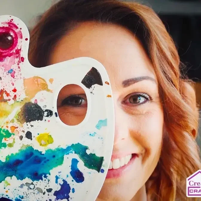
✨ NEW SERIES!! ✨ Introducing a fun way to mix and combine your Distress Oxides to create stunning backgrounds for all your paper craft projects!
In this series I will create a video dedicated to each of the Distress Oxide colours, discovering and sharing the effects achieved when they are layered with other colours in the Distress range.
hi everyone welcome to another episode
of the distress oxide layering guide now
today we are going to be using antique
lemon because we are working through the
colors alphabetically so this is the
third video video in the series already
we've got some beautiful backgrounds
made simply by using this smooching
technique and mixing our distress oxides
you'll be able to see these ones already
in the playlist and today we're going to
create three more now with each one what
I tend to do is create three as I say
the first two are using the chosen color
the color for the day um as the first
color laid down and then I use this as
the last color just to show you the
difference with oxides you really can
layer them up and the ones that go on
last tend to be the most prominent but
you'll see that for yourself so I'm
going on to a gray mat the mat is linked
in the description below if uh you want
to take a look at something like this
and let's first of all load up a piece
of our watercolor paper with this
antique linen now antique linen is a
pale color so you can just about see
that there in fact I'm probably going to
turn my lights down even lower just so
that there's less shine so you can maybe
see it a little better there we go with
a little less glare you might be be able
to see that a bit more but let's dry
this
off and then I'm going to add a second
layer because there's still Lots on the
mat there so we'll be able to pick up a
bit more now at the end of each of the
videos I do zoom in in to each of these
swatches so you can really clearly see
the color and the patterns that we've
got and as you can see there hopefully
we are now picking up a little bit more
now because antique linen is a pale
color none of the colors I'm going to be
using today are going to be strong ones
because I want to make sure that we're
not overpowering this beautiful yellow
so there's one Swatch I'm just going to
do a second one with the same color
ready for layering a second color onto
each
okay so the first of the second colors
that I want to lay down is bundled Sage
a nice pale green I love this color it's
for me it's a perfect pastel green so
you can't really see it on this mat I'm
going to try and get you a white matte
instead so something similar that I can
be using because I think that will help
you to see the uh colors that I'm mixing
a little better later in the series so
I've added the green it's absolutely
beautiful let's dry this first layer off
because everything looks different once
it's dry so colors often lighten a lot
some areas darken a bit more where
you've got a blob of color and then it's
more concentrated um and you get the
beautiful mixes as
well now it's well worth you
experimenting and create creating your
own swatches so you can really see the
colors now what I love about antique
linen and you can just see it starting
to happen here is you've got some areas
where the brown is showing up even more
than the yellow um I think that's
beautiful now with what's left on here
of the bundled Sage let's go in a second
time and as I say when you are applying
uh a color over the top of another very
often that second color that top color
is going to be the one that stands out
the most as it is with the green here
but because of the antique linen we've
got a really nice warm base underneath
where bundled Sage could be considered a
cooler color
otherwise and dry that off and now we've
got the green with these beautiful areas
of yellow peeking through even some
Browns as well and it's really beautiful
I would happily create leaves from this
die cut leaves out of these absolutely
gorgeous so there's one and like I said
we will come in we zoom in to each of
these um before the end of the video so
you can really see how they have mixed
and all those colors and different
patterns that are in them so with the
second antique linen layer let's now
move on to the next color which is
Victorian velvet so putting this one
down and again let's give this a spritz
some colors you'll find you don't need
two layers of them when you layer them
up and in fact one is enough uh I think
Victorian velvet may be one of those
actually because this is quite a strong
color I like that we've got the yellow
underneath but I think I'd be quite
quite happy to leave that just with one
I think two layers would be too much as
you can see although it's quite a pale
color on the label almost a pastel you
do have some darker areas coming through
but you've still got that nice Yellow
base underneath and they have mixed
really nicely I love that we've almost
got some peachy tones coming through as
well I don't think I'm going to add a
second layer to that I think that I
always leave a at the bottom for me to
hold on to not get Mucky fingers but
that is beautiful I love that if you've
got areas like this that you're not
happy with but don't want to lay color
over the top you can just try putting
some water on letting the water soak for
a minute and then drying and see if that
just fades it out a little bit it'll
kind of blur it a little and there I can
already see that we've got some orange
moving about there from picking up from
both the colors so let's dry that
again and see what happens I can really
see the oranges is coming through now
beautiful difference in fact I think
because I like that so much that has now
faded out can you see where the we had
those harsh
Speckles that has faded that out a lot
but what that's done is it's mixed the
yellow and the purpley pinky color given
us orange and the orange has pulled so I
think I need to do that over some
more let that set s settle just for a
moment can I don't know if you can see
that's starting to happen in a few
places just let that do what it's going
to do so we've got some orange appearing
here let's do a bit more up here as well
make that nice and
even there and some up there and now
when I dry these as you know the water
evaporates the colors sort of go to the
edges we'll get those patches on the
rest of the designs so then mixing with
the water
creates a whole other effect this is why
I love oxides and
inks so much you get so many different
looks just by using something as simple
as
water there we go beautiful little bit
of wet still there but absolutely
gorgeous love that okay so now this is
the time where we actually use our third
Swatch and instead of mixing with the
antique linen first we're going to mix
with these two first instead and the
antique Linen on top and let's see if
that brings out more of the yellow now I
am going for a slightly darker color so
I have got saltwater taffy I'm not going
to put too much of this down because I
know it is a darker shade so quite a bit
of water with this
one there we
go so that's given us because I put so
much water down that's actually given us
a bit of a watercolor wash rather than
the
splatters so dry this off and then I
will just pick up these splatters as
well to add a bit more texture in you
see it's it's lightened up I put enough
water on so it's not too
dark just get these this nice and
dry dry enough so that it won't react
instantly with the next layer and then
again tap it
in there we go just getting some
Speckles on there so that is salt water
Taffy little less orange than you'd
probably
see on the label but if you're
interested in these oxides and you've
not used them
before you can go and have a look at my
um distress oxide and ink or ink and
oxide combination series The all the 72
colors are on that series on that
playlist and we actually look at each
color individually mix and match it with
other colors in the range as well do
some blending um and we really delve
into what sort of colors they are are
they similar to the label and what will
like I say what they will mix with
nicely so go and check that out if you
haven't done already now I've got my
weathered wood this is a pale call it a
gray blue so this is really going to
cool down the saltwater taffy a
lot look at that but then I'm hoping
we're then going to warm it up with the
uh antique linen so that's adding that
gray blue let's dry that off I don't
think I want any more of this I think
this one one layer is more than enough
it was dry enough so I did get actually
there's a little bit more on the mat
let's just pick that up there we go it
was dry enough that I didn't get a wash
like I did with the first layer of the
saltwater taffy so I did get some really
nice texture in there anyway and don't
forget of course you can absolutely just
use this combination if you like
it let's dry this off and let's go in
last of all and I'm going to go quite
heavy with the antique linen now so this
is going to be my last layer going to
put lots of this on because it's a light
color it is a pale color but I want to
see if we can make this stand out more
so let's press it into the
yellow calling it a yellow I guess it is
more of a yellow or cream color so this
one because there was lot quite a bit of
water that is a bit of a wash over the
top of the tube but you can clearly
still see looks like Stone looks like a
pebble so let's dry that off and then it
does all fade so it's it doesn't always
seem quite as obvious once it's
dry beautiful background I'm really
loving that second one just seeing in
the corner of my eye here really loving
that with the water Splats
on looking forward to doing some of the
really strong colors like villainous
potion for example and Uncharted Mariner
which is actually my favorite in the
distress range
there we go and then I'm just going to
pick up the excess on here just to get
us some darker yellow splatters and then
we can clean up and we can have a quick
look at these all three of these really
close have a look at that texture and
all those beautiful colors that are
coming
through so you definitely can see the
yellow the yellow is the standout but
the other colors coming through it
really does look like it beautiful rock
or stone so let's now zoom into these
have a look it's hard to believe you've
got the same color running through all
three of these but let's have a look at
these closeup gorgeous colors so you can
see for example you've got here the
green and the yellow
Speckles absolutely beautiful that one
so that is the bundled Sage with the
antique linen this one is my
favorite isn't that gorgeous you see see
that peachy color around the edge of the
watermarks that's more pink there's
definitely more Peach hair around the
edge of the watermarks and that's from
those two colors mixing I adore that one
that is beautiful I'm definitely going
to make more backgrounds with that
combination can you almost see purples
coming through as well though from the
um Victorian velvet this one wasn't it
gorgeous and lastly the three colors
that we used we look at that one closely
you can sort of see the Browns so the
first one down was saltwater taffy that
does come through you can see Speckles
of it in there in the
background and then you've got the gray
which or the weathered wood which is a
blue gray and then you've got the yellow
on top so all three of these absolutely
gorgeous I love them they are going to
be added to the other backgrounds that
I've already created so we've got now
got nine backgrounds already all very
different but a really nice library to
have and what I've been doing is I've
been writing on the bottom of them which
colors I've used so I can keep these on
a ring binder for example uh or a book
ring rather and see which ones I want
for each project so I hope you found
that helpful creating these three
swatches and don't forget to join me
again because I will be doing some more
again very soon I'm hoping for at least
two of these videos a week if not more
to work our way through the entire 72
colors of the distress oxide range thank
you everybody take take care and I'll
see you again very soon