
How are astronomical illustrations made?
Dec 7, 2024
This is the episode you've been waiting for.
The one where I finally blow ESO's cover and reveal the truth.
Welcome to Faking Starlight.
These beautiful images we've been showing you, fake, fake, fake, fake.
They weren't taken with our telescopes but created by artists.
So how do you spot a fake?
Why would an organisation like ESO be putting out fake images in the first place?
Well, calling them fake is a little bit harsh.
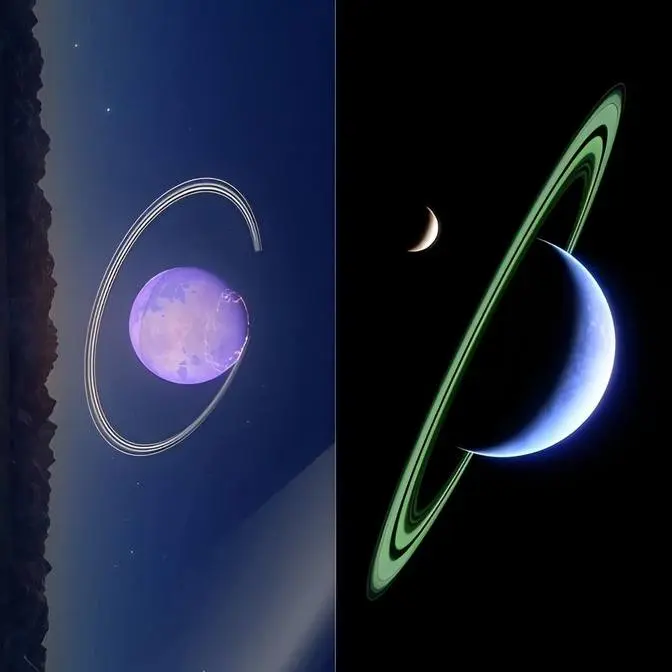
They are actually artists' impressions of very real objects and phenomena in our universe.
And they're based on real data.
The thing is that even with very large or extremely large telescopes,
we can't see everything in our universe.
And even if we can, sometimes we just see fuzzy blobs,
These are super exciting for astronomers because they tell us a lot about the physics of the object,
but they're not so visually beautiful or interesting for most people.
So we need talented artists working side by side with scientists
to bring you these beautiful visualisations of very real objects.
Now you know that not all astronomical images are real,
let's see whether you can spot the fake.
We'll start with this view of the Pillars of Creation.
These are huge columns of gas and dust,
carved out by the intense radiation of young nearby stars.
So what do you think?
Well, this certainly looks like a real image,
and in fact we have plenty of them of this very object.
But this particular view is fake.
How do I know?
Well, because it's in 3D.
Telescopes can't take 3D images,
so artistry was needed to bring this particular view to life.
But science helped a lot.
A few years ago, astronomers observed the Pillars of Creation with MUSE,
an instrument on ESO's Very Large Telescope.
From the data, they were able to figure out how the gas is moving,
and how the nearby stars are making it glow.
From this, they could reconstruct the location of the different pillars in space,
essentially creating a 3D map.
And our artists were able to use this to create the beautiful visualisation you see here.
Doesn't it just feel like we're flying through the pillars?
OK, let's try another example.
What do you think?
True or fake?
Well, if you guessed fake, you're absolutely right.
What we're seeing here is a visualisation of an exoplanet.
Exoplanets are planets that go around stars other than the Sun.
And compared to the planets in our own solar system, they're very far away.
So this means that they're very faint and very small,
and that, at least with current technology,
we cannot see any details of their surface or their atmospheres.
Just to make a point, check out this image here.
This is a real image of an exoplanet.
We have plenty of clues from science to help us make an educated guess
what these alien worlds may look like.
Remember the wiggly lines I talked about earlier?
Spectra?
Loved by scientists.
Hated by science communicators.
A spectrum is the result of light being split up into its individual colours.
This is what happens to the light of the Sun when a rainbow happens.
Spectra are not much to look at,
but they can tell us a lot of interesting physics about the exoplanet and its host star.
For example, they can tell us what temperature the star is and what colour it should have.
They can also be used to help find the mass and the radius of the exoplanet itself,
allowing us to deduce whether it should be rocky, like Earth, or a gaseous planet like Jupiter.
All of this information can be used by our artists to create stunning exoplanetary landscapes.
And actually, they're not that far away from here, so follow me and we'll visit one of them.
This is WASP-76b, an exoplanet orbiting a star over 600 light-years away.
Using a special spectrograph mounted on ESO's Very Large Telescope,
astronomers found that, on this planet, it rains iron.
We won't be able to see or experience this first-hand except from in our wildest sci-fi dreams,
but we can use the spectra to help our artists create spectacular visualisations
of what it might look like on the surface of this planet.
Finally, here's an image of a planet-forming disk.
If you guessed that it's fake, you're absolutely right.
But why?
Let's start from the top.
Astronomers first theorised that planets formed from disks around stars over 200 years ago.
The problem is that these disks are very hard to image
because they mostly emit in the millimetre part of the electromagnetic spectrum,
which neither our eyes nor optical telescopes can see.
So we had to wait for a new generation of millimetre telescopes to image them.
In the meantime, all we had were illustrations like these.
These illustrations were informed by centuries of scientific knowledge.
We suspected that these objects are disks around young stars made from gas and dust.
And we also suspected that there are gaps in these disks
that are made by baby planets tracing their way around the star
and pulling the material from the disk.
However, we had to wait until the advent of ALMA,
in which ESO is a partner, to get a real image of a planet-forming disk.
In 2014, ALMA took its iconic image of HL Tau.
And I'm absolutely stunned, I have to say,
because this image looks just like the artistic impressions.
I hope I've managed to convince you that artist's illustrations
are useful for visualising astronomical data.
And now that you're experts, let's try a little quiz.
Can you tell which of these pictures are real astronomical images
and which are artist's impressions?
Let us know in the comments.