
How to PAINT a PORTRAIT - Painting realistic SKIN TONES in Oils + GLAZING
6 Video Views·Mar 18, 2026
In this video, we're going to paint a portrait.
Here's my reference and here's my painting.
I'm going to walk you through the process and share with you some really cool techniques.
Roll that intro.
Hi there and welcome to the studio.
My name's Andrew and it is an absolute pleasure to have your company.
If you're new here, this is a place where we talk about all things to do with oil painting,
so consider subscribing.
Now in this video, we're going to paint a portrait and here's the subject.
This is Kimmy and I thought she would make a fantastic painting.
So I shot some reference photos here and I captured her from a few different angles.
Now just a side note, you might notice a pheasant and a rabbit appearing in some of these pictures.
I had an idea a little while ago that I'd actually include an animal in this painting,
so that's why I used this prop.
But here is a couple of little angles just of the side of Kimmy's face as she's turning
into the sunlight.
What I really love about these images is that balance of warm and cool light, that beautiful
sunlight glistening off the skin and that three-dimensional form that's revealed from
that glow of ambient light from above.
I was fascinated by the wide variety of skin tones that were present in this reference
material, so I wanted to challenge myself and see if I could capture that with oil paint.
Now often when we're painting from photographs, it can be really tricky to capture all of
the colors that we see and not create a flat painting.
So creating some three-dimensionality here was my primary focus in this painting.
That naturally is going to require quite a bit of layering and I'm going to talk you
through the process of how I build up the portrait.
Now let me quickly talk to you about the materials I'm going to be using in this demonstration.
On my palette, I have ivory black, burnt umber deep, yellow ochre, white, which is a combination
of crimnitz white, which is lead base, and titanium white at a mix of 50-50.
I've got cadmium red light, permanent crimson, cobalt blue, and chromium green oxide.
I'm using a wide variety of brushes here and I'm going to share those with you throughout
this demonstration.
Now there are so many different ways to paint a portrait.
Here in the studio, I take a wide variety of approaches.
In this painting, I wanted to start off direct.
That's using bold brushwork to build up the form quickly and then go through a process
of refining the portrait as that medium starts to dry the paint and I start to set up a bit
of a surface tack.
So I'm going from loose, broad brush strokes in the initial stages to much finer marks
towards the end of the process.
It's all about trying to build that richness in the surface of the painting and make that
skin come to life.
Now that's enough talk.
Let's get stuck into this portrait.
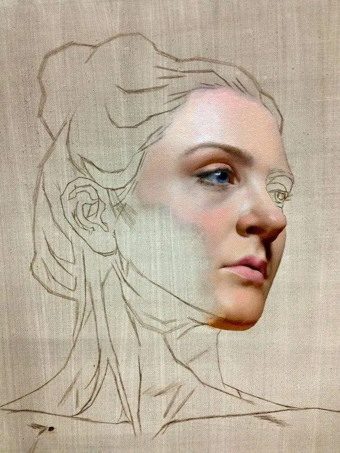
I mix up a dark color that's comprised mainly of permanent crimson and cobalt blue and this
is what I'm going to use to sketch out the face and I'm sketching here using a synthetic
filbert brush using some proportional dividers to help me solidify the location of some key
features.
Once I've located the center line of the face, it becomes relatively straightforward to locate
the brow ridge, the eyes, the nose, and the mouth.
Once I'm happy with the line drawing, I remove some of the construction lines using a bristle
brush with just a touch of Liquin Original Medium.
Now, even though I have black on my palette, I'm going to mix up a reasonably dark tone
with cobalt blue and burnt umber.
This should be dark enough for the block-in stage.
Now, I'm going to start with the hair here and some of the background to provide context
for some of the skin tones within the face.
Because of this dark tone in the hair and the background, it's going to become much
easier to gauge the values and the colors within that face.
I'm going to leave the background pretty loose and sketchy with loads of bold brush
marks.
I like the way the image falls apart towards the edges of the painting.
This is going to draw more attention to the face, which is going to be quite detailed
by comparison.
With a filbert bristle brush, I lay in some cool skin tones here on the side of the face.
This painting's all about that contrast between this cool ambient glow from the sky above
and that glistening skin in the sunlight.
I try to cover as much ground as quick as possible with broad tiles of color, and then
I can come back and blend slightly between these strokes to reveal more of a three-dimensional
form.
For some of the warmer tones, I'm using burnt umber, permanent crimson, and yellow ochre.
This is a fantastic combination to get some real heat to come through that skin.
This is also great for some darker skin tones, perfect for some of these deeper shaded portions
of the neck.
Now, to avoid my skin colors going chalky, I'm using plenty of lead white.
That mix of criminance white with titanium white at a ratio of 50-50 is ideal for painting
skin.
Normally, when using pure titanium, skin tones can tend to go a little bit chalky, almost
pastel in character.
I start off relatively dark and muted.
Notice here in the sunlit portion of the face how dark that color is.
This is a color that's going to show through some lighter marks that I'm going to come
and add later.
But the darkness of this color and that nice warm yellow is going to contrast beautifully
with some cooler lighter marks to be added over the top.
Now, portraits can tend to go through a bit of a goofy, weird stage.
This is just something that we have to work through in those initial stages to get to
the good part.
And I'm constantly checking my progress from a distance.
Because this portrait is not projected or traced, naturally, some things might be off
here and there, and maybe some adjustment will be needed.
I do enjoy the challenge of painting the portrait freehand, but there are still some frustrating
moments now and again.
It's just a matter of sticking with it.
Adjustments can always be made throughout the process.
And that said, because I'm keeping my marks here relatively thin and I'm keeping that
texture low, despite the fact these are pretty broad brush strokes, I can always come back
and work over the top without having any ridgelines or ghosts from the previous strokes.
This makes it easier to add layer upon layer whilst maintaining that smooth surface.
Now, Kimmy's wearing a white dress here in my reference photographs, but I'm not going
to the top of the tonal range and painting this out white.
I'm looking very closely at the value of that dress.
Because again, I want all of the tones to work out more or less to give preference to
the sunlit portion of the face.
That's got to be the brightest spot.
So I'm dulling down and muting those tones here in the dress with combinations of cobalt
blue and burnt umber.
I want to keep the brush strokes here nice and loose.
And again, this will help drive attention towards the face where most of the detail
is going to occur.
With just the end of a flat brush, I'm dragging some darker color through the wet paint to
indicate hair.
Also, a synthetic point and round works great for this.
Now it's time to work back into this face and I'm going to start paying closer attention
to the three-dimensional form, adding some softer strokes of color here using a quarter
inch one-stroke red and a number five series 279 long flat.
Both of these are synthetic brushes and they work great for some of these softer strokes
of color and creating some roundness within the form.
You have to continually reload that brush though.
A little bit of paint goes a long way, but I need to continually accumulate paint towards
the lead edge of those bristles.
So I'm making effective strokes.
This brush is great for areas like here in the lips, creating that dark line with some
sharpness.
This separates the top lip from the bottom lip and then I can go about creating some
cooler tones to start rounding out some three-dimensional form.
Now, because I'm using the same brush, I have to go back and continually wipe the ends of
those bristles just to maintain clean color.
Now you'd be surprised what kind of interesting colors you can find in a face when you look
really closely.
Here in Kimmy's eye socket, I'm seeing a lot of blues and purples coming through as
well as some green.
It's amazing how color is determined by its relationship to other colors.
For instance, something's only dark because it's next to something light.
Something's only high chroma or saturated because of its relationship to something
desaturated.
The same is true for complementary opposites.
And I'm playing these relationships off against one another constantly.
The opposite of red is green.
So notice here how just a little bit of green seems to pop in amongst some of these warmer
skin tones given by plenty of red coming through.
I find this really helps when creating realistic skin tones with plenty of vibrancy.
It's given by using opposing colors and a wide range of tonal values.
Now I want the slightest amount of definition here towards the edges of my portrait, working
into the hair, creating some darker tones with just the end of a bristle flat brush.
I come back and add some cooler notes of blue, which is given by cobalt blue mixed with burnt
umber and some white.
This indicates more of that cool reflected light from above.
Now I start to add to the intensity in the side of the face, and I'm noticing a warm
glow coming through in Kimmy's cheek.
So I'm mixing up varying amounts of red using that permanent crimson, burnt umber, and yellow
oxide, along with some cadmium red.
I create some fragmentation with some stippled strokes and then work between these brush
strokes with some cooler color.
To smooth out the skin, I can blend ever so slightly between strokes.
Because the underlying layer of brush strokes hasn't dried completely, I'm still able to
layer over the top with some of these finer marks without mobilizing that underlying paint.
But at the same time, I'm able to blend just a touch.
This is really helpful when creating some smoothness in the skin.
I cool my combinations down and darken slightly towards the edges of the face, where the form
turns down towards Kimmy's jawline.
So I've mentioned before that I work from whatever's general towards specifics.
So once I'm happy with the form overall, I then begin to hone in on individual features,
like the nose.
I define the nose further with a synthetic pointed round, using a combination of burnt
umber and cobalt blue for the deep recess of the nostril, warming up slightly with permanent
crimson.
Then to create more of a flare in the nostril, catching some of that ambient glow from above,
I'm using a synthetic flat.
I'm getting some really nice cool glow with that cobalt blue.
Not only am I holding back with my tones, working from something that is relatively
muted and dull towards a wide range of values, but I'm also doing the same with my colors,
starting relatively desaturated and increasing the intensity of chroma towards the later
stages of the painting process.
So here on the lips, the intensity of that crimson coming through, it's getting stronger
and stronger.
And I'm adding just tiny little bits of color with the end of a synthetic round or that
long synthetic flat.
To create some roundness and three-dimensionality within this form, I pay close attention to
that boundary between the light and the shade.
Now it's time to mix up some of that intense highlight color for this sunlight glow that's
shining off the side of Kimmy's face.
Now here, I'm using a bristle dagger, and just the ends of the bristles are loaded with
pigment.
This is a combination of white and yellow ochre.
And notice how I'm not painting out this area, but there are little gaps between the
individual marks made by those bristles, where that deeper, warmer tone is showing through.
This is not only going to help create some variation and interest, but it's also going
to help the skin appear a bit more realistic, like it's glistening in the sun.
My favorite brush for this technique is an old frayed bristle dagger, where the hairs
are splayed apart.
It creates some really interesting marks.
Sometimes I'll even trim my bristle daggers to create some really interesting paint applicators.
This is also great for the intense highlight that is shining off areas like the lips.
It creates a random assortment of tiny little highlights.
I get some variation in these colors with some more saturated reds, and then as the
lips turn into facing that cool ambient glow from above, I mix in more cobalt blue.
Even when I'm saving my tonal best for last, I'm saving my tonal best for last.
So just when I think I've gone to the top of that tonal range, because I hold back and
I don't use pure white until the very end, it means we can continually increase the intensity
in those highlights and push it ever further.
Also, I'm using, for the majority of this demo, a mixture of criminance white and titanium
white at 50-50.
This doesn't reflect as much light as pure titanium.
It's that pure titanium that I save for the very end.
With the same trimmed bristle dagger brush, I can apply some finer highlights to the hair
that's catching that sunlight.
This separates and lifts the hair out from that background.
Now, to create more form within the portrait, I'm going to add some thinner strokes of color
to increase the intensity of tone in the shadow.
Kimmy's face here seems rather full, so I apply a bit of a shadow here along the cheek,
defining that cheekbone further, and bring the same strokes of color into the eye.
Now, I'm applying this over a relatively dry painting with a synthetic flat brush and also
adjusting some of those finer shadows with the synthetic pointed round.
I then come back and work that edge of the hair, lifting out individual hairs that are
contrasted against the face.
One of my favorite brushes for painting hair is a synthetic rigger, double zero.
Just a few of these hairs will catch some direct sunlight and have a direct glow shining
off them, and this is given by that Cremnitz white titanium white 5050.
Just tone down slightly with a bit of burnt umber.
I don't want any of the highlights here in the hair to compete with the face,
so a delicate approach here is needed.
I mix up some burnt umber with permanent crimson and a touch of cobalt blue for some of these
freckles and apply it with a synthetic pointed round.
I then go back and blend slightly some of these strokes into the surrounding skin tones.
It does help having a painting that is more or less dry when applying this technique.
Variation is key here to get this to look as natural as possible,
so I pay close attention to my photographic reference.
For even more intensity in the skin tones and depth of tone,
I'm mixing up more of a glaze with permanent crimson, cobalt blue, and burnt umber,
and then I deepen the value of some of these darker shadowed portions.
I keep my strokes of color nice and thin, and my use of medium here is key.
I'm never using more than 25% medium with my mixtures.
That's one part medium to three parts paint.
Normally I have two brushes for this process, an applicator and a smoother.
This synthetic round smooshing brush is perfect for some dark shadow glazes.
Similarly, I can apply some lighter glazes
to some of the portions that are showing more of that ambient glow from above,
and this is a combination of white, cobalt blue, and burnt umber just dry brushed over the surface.
This is great for lifting out areas in the neck,
such as those tendons that attach to the collarbone,
and I mix a bit more white with this and some cobalt blue
to communicate the reflection of sky off the eyeball.
The final marks are these little adjustments of deeper tone
applied with a synthetic pointed round.
It's these final sharp details that bring the portrait into a crisp focus.
I'm really happy with the way this painting turned out.
Normally I'd detail the portrait much more,
but here I decided to take a looser approach with everything that's going on around the face.
So you'll notice that the painting almost falls apart towards the edges.
I feel this channels the viewer's attention into the face where I had most of that fine detail.
Now as the liquid began to dry, it made layering possible
where I could build up some of that intricacy in the surface.
As the liquid original began to dry, the painting set up a surface tack,
which made it really interesting to work back into and build up the richness in the painting
to really make the skin feel like it was alive.
Now sometimes when I put the final strokes of detail on the surface of a painting,
it can be really hard to gauge what my tones and colors are doing.
Maybe you've noticed this, but sometimes our painting surface can go from matte to gloss
and it can be quite distracting.
It's also a bit disheartening when we finished our painting
and we need to have that ready for an exhibition.
Now if I don't have time to apply a final varnish,
which sometimes you need six months to a year to apply that final coat,
I'll just go over it with retouch varnish so long as the painting is thoroughly touch dry.
For this process, I use Art Spectrum retouch varnish,
which is a ketone resin suspended within a solvent.
For retouch varnishing, I'm going to need a clean tin.
Now this sardine tin should do the trick.
I'm going to need a clean cloth and I find t-shirt material works the best.
Also, a new pair of nitrile gloves and a clean brush.
This is key.
I'm going to use a brand new Tisch Dagger bristle brush.
This should do the trick.
Now I'm only going to get out the varnish that I need.
You'll be surprised, a little bit goes a really long way.
I start at the edge of the painting and work my way across, checking for any dry patches.
I'm also very careful not to apply too much action to the surface.
The ketone resin is suspended within a solvent after all,
and vigorous action might lift the paint.
I use a rag to help me pick up any stray bristles off the brush
and I'm constantly on the lookout on the surface of the painting
in case I've dropped the odd brush hair.
Now after applying the retouch varnish, the painted surface can be pretty shiny.
This goes away after a little while though
and you'll find that it dulls down to a beautiful satin finish.
Now the beauty of retouch varnish is,
it still allows your painting to dry through that varnish layer.
I've been asked in the past about whether you have to
remove the retouch varnish before applying the final varnish.
I've heard two different schools of thought on this
and I tend to kind of stick with what's easier.
I've heard some people saying you absolutely must remove the retouch varnish first
and then apply that final varnish,
but I personally have had no issues going right over the top of retouch with final varnish.
I'm really happy with the way this portrait came out.
It was a challenge to capture all of those different skin tones
and that ambient glow from the sky above and balance that out with some bright sunlight.
But it sure was a bunch of fun trying to recreate that three-dimensional form.
Now this demonstration that you've seen here
is just one part of my upcoming portrait painting tutorial.
This tutorial is going to have six different demonstrations of six different models.
We're going to take a wide variety of approaches to the portrait
and I'm going to show you six different ways we can capture a likeness.
We're going to have all sorts of different kinds of skin tones,
different hair.
I'm going to talk about painting beards and mustaches
as well as capturing light and three-dimensionality.
We're also going to talk in depth about wrinkles and skin texture
and I'll even have a section in there on how I paint tattoos.
This portrait tutorial really will have it all and it's coming very soon.
I hope you're as excited as I am.
Now depending on when you're seeing this video on YouTube,
it might have already been released.
So check that link in the description down below.
Now you can be the first to know about the release of this portrait painting tutorial
by subscribing through my website.
It's absolutely free to do so.
Simply go to andrewtishler.com slash subscribe
and you'll be the first to know when I release this epic portrait painting tutorial.
Now if you liked this video then please do me a huge favor and share it.
Click that like button and leave me a comment down below
but make sure you're subscribed to this channel.
I've got plenty more painting tutorials on the way.
It has been an absolute pleasure having your company here in the studio
and I look forward to seeing you again soon.
So long.