11 Video Views·Jun 3, 2022
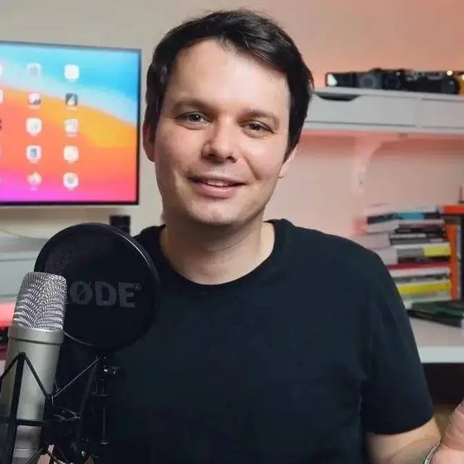
Today we critique your photos with Dotan Saguy
Check out Dotans's
Instagram: @dotansaguy
Website: https://www.dotansaguy.com
If you are interested in being notified about Dotan’s
future street photography workshops you can email
him at [email protected]
You can find Dotan's books here -
https://www.dotansaguy.com/books
INDEX:
00:00 - Hello there!
01:06 - Dotan’s method
02:23 - @stefankurzeja
07:12 - @Chongqing
13:31 - @shorty.shots
18:25 - @jhemming
25:49 - @robshum
27:46 - Dotan’s Project
28:16 - @robshum
32:27 - @mccurdy.photography
39:52 - My photo :) - Prague
46:24 - @dotansaguy
51:43 - The end :)
People often say, if you don’t share your images yourself, no one is going do it for you, right? Those people are actually wrong.
Join me live this Tuesday to see all the photos submitted for Round 7 - Color Street photography.
Find out more: https://aboutphotography.blog/submit
Submit your photo for live stream promotion: https://www.reddit.com/r/aboutphotographyblog/
Once per week, you can upload your photo to my subreddit. On Tuesday, I will review your photos and pick six of them. The three most popular ones on the subreddit and three that I like most will make it to the final six and all of you can vote and pick the winner. Just upload your photo to the subreddit, and you are done for a week.
When you share your photo, add a comment and don't be afraid to share your links. It is actually encouraging you to share your portfolio (Instagram, website, etc.). Share the story of the photograph and share your story. Also, if you want to join the live stream to introduce your photography or your photography projects to others, you can also add your Skype ID and join me and talk about it with me.
______
Learn the Language of Photography Through Critique Rules Of Photography Critique Professional Photographers Critique Your Photos Photography Techniques you shouldn't ignore REACTING to Your "BEST" PHOTOS EVER! Reacting to photos of my subscribers
Your mind starts going and trying to make up stories. You gotta give enough to the viewer
so they can start making up stories about what the photo is about. I would call it a little bit cheap
you know kind of technique of finding a nice background and just waiting for somebody to
walk through it. You want people to linger on your photos you don't want them to just be stuck and
move on. At the end of the day that's what you want to create an emotion with the viewer.
Hello everyone welcome back to the channel and today I'm here with award-winning photographer
Dotan Saghi. Dotan has published many photography books and specializing in black and white
photography and today he's going to be critiquing your photos. Hello Dotan how you doing thank you
for joining me today. Hi Martin it's good to be with you thanks for having me on. Perfect so for
anyone who is joining us for the first time the idea is that I'm gonna show you the photos of
people who submitted their photos and I would like to ask you for constructive critique probably
as if they were your own. Sounds good I'll do my best. I don't know if you know my method I teach
a method in my workshops and I have this online workshop as well but I like teaching in person
better and one of the things that I teach and this is happening it's starting to happen again by the
way you know with the pandemic kind of going away and I actually had a workshop in Venice in the
fall with Leica so it's starting to happen again and one thing I always teach my students is both
for looking for the right photograph as well as when they're editing their work to look at the
photograph or through the viewfinder with d i and m so this is a methodology that I teach which
is basically always look at things through a kind of three different criteria design
information and moment and so this is how I'm gonna review these images it allows also when
I review my own images I do the same thing and it allows me to kind of keep a distance because you
know we tend to when it's our photos it's our babies and we it's hard to be to judge your own
photography so it really helps to have a tool like this to remain objective so that's that's
really the the challenge all right so let's do it so let's take a look at the first one
what do you think all right so I so this is a black and white it looks like a woman in a coat
um looking back at a crowd in the fog or some you know there's some smoke that's kind of
obstructing the view of the of the background so if I look at it through the prism of through
the lens of design purely design I think you know the design here with the subject centered in the
middle and um you know all this mystery around it and there's a very good figure to ground so
we're gonna like throw terms in there which some of your viewers might know some might not
essentially figure to ground means contrast between the subject and the background so
that the subject pops that's all figure to ground is so there's great figure to ground
and so so I think you know in terms of design it's actually quite pleasant and it's a photo
that you know if you see it in a stack of other photos it kind of pops out so because the design
is so deliberate you know there's no it's very minimalist in in a way so that's I think the
design is quite you know quite nice the if I go to the information remember so it's like
this acronym of DIM design information moment so if I go to information um I would say the
information is not so great here but you know sometimes it's intended by the photographer to
have a photo that's a little bit mysterious or that you know lends itself to different
interpretations but if this was you know photojournalistic or documentary in nature
and I'm just being shown this particular photo I can't see the face of the subject so I don't
really know what they look like or what expression they have which is very important you know as
humans we it's something that we uh you know we read a lot into so not being able to see the face
of the subject we you know we don't know um and so there's very little it's a very mysterious
photo in terms of information and you know you may or may not like that I think you know in in my
case I would say I would have preferred a little bit more information like give me something at
least to kind of I like to have at least enough information for me to make a story to make up a
story in my mind of what's going on even if it's not the actual truth of what the photo represents
I like to give my viewers when I take a photo enough that they can make up a story around it
and here I feel like I'm a little bit short of that I'm a little bit short changed here
not enough in in the subject itself and then the background is also so smoky um I don't know if
it's a crowd of people watching a game or if they're protesting or I mean and I don't know
maybe I haven't looked at it long enough but usually these things kind of should come to you
fairly quickly because people when they see a photo and they can't make sense of it they just
go to the next one so that's why I like to give viewers in my own photos enough that they can
cling on to the photo and stay with it a little bit longer and that's really the the goal you know
when you're showing your work to somebody else that they stay longer on each photo so this one
I feel like it's not enough to make me stay so that's on the information side and in terms of
the moment I would say there's also I don't know that I mean the moment I guess would be more I
guess uh tied to the design here where maybe this is someone passing by in the foreground and they're
in the middle at the moment that the photo is taken um it's also the smoke and the environment
you know maybe there's something that provocated that's you know that that uh made that smoke
happen uh maybe a flare in a you know game or something and so maybe the moment that that's
the moment but it's not a I would say it's not a super strong moment uh it's just a yeah it's
so in other words you know so if information is lacking and the moment is not you know a peak
moment then this photo is all about design and you know that might be fine to somebody to have
you know that some photos actually stand out especially like minimalist photos things like
that sometimes design is enough to carry a photo you don't need information or a moment that much
so you know so that that but that this is a photo you know when you review it uh as as your own you
know work you have to be aware this is all based on the design and you know then you have to ask
yourself is the design strong enough to carry the photo by itself um so in this case i mean i'm still
not um totally sold that that it is in this case but uh but it might be for someone else you know
so people like different kinds of photos all right i'm more of a documentary person so i like to have
a little more of a story and information behind it ah thank you all right moving on all right
so um so okay so the second photo i'm gonna go and use you'll hear this i mean by the end of this
you're gonna be tired of hearing about dim design information moment but this is you know my method
so i'm gonna follow it again and in this case the design is actually for for an urban environment
that is you know looks gonna you know could be fairly chaotic and so on the design is very well
thought out and very i would say pretty well executed given the circumstances of where this
is shot so um this is you know i would imagine some suburb or you know it's kind of a dense
urban environment with lots of tall buildings and cars and streets and and so on and in this case
um there's a symmetry here where you have those three cars the tree spank in the middle the
buildings are kind of bookending uh the photograph you have one building on one side another on
another side uh even those cones are are placed you know sort of almost at the third and then
you have this uh you know this young uh adolescent boy just uh crossing the uh crossing the screen
here uh and he's on the on the third so i would say this design is clearly has been thought through
you can even see that his face is popping up in a blank you know one of the few very few uh blank
areas of the screen so you it actually the figure to ground at least for his torso and his face
they're they're you know the the figure to ground is pretty good uh so uh not for the rest of his
body it's kind of more against the car but you can see his foot and you know so there's no problem
distinguishing the subject here and so design-wise i would say it's you know it's well executed for
where it's at you know whether you know this is uh uh you know it depends what you know what the
photo is about and and i i would see this maybe as part of a documentary and like a larger body
of work where uh i'm not sure as a street photograph that the you know the design is
enough to carry the photo here but you know if this was like part of a series of um of photographs
on some uh you know suburb somewhere and it was telling the story of people living there maybe
that that you know that it would make sense you know the design would be strong enough for that
as a street shot i don't know if it's you know this is not the it's the photographer is working
with some very challenging backgrounds here so um and you know and it's layered so that's the other
another part of this design that that is you know positive here there's you get the the subject and
the cars and the tree and then the building so there's several layers to this so there's a little
bit of interest there okay so now if i go to the information um i mean this is a a young person
carrying something i'm not sure there's a bag it looks like there's a bag and he's just walking
so and i mean you can tell what the environment is like so there is information there in terms of
representing the kind of environment that the subject is evolving in but uh there's other than
that i don't really know like this photo doesn't tell me much about the person other than where
they live or where they you know where they're walking so and i don't really get more information
than the person is walking uh carrying some kind of bag so there's not a ton of information there
it's more circumstantial like this is where the person is as far as the moment i would say that's
probably the weakest point of this photo which is um it's kind of you know it's it's done a lot
in street photography where if there's nothing interesting in the street photographers will
just photograph somebody walking through a background so you know people do that a lot with
you know there's like an advertisement that is interesting that you know maybe i can have
somebody walk through the frame with the advertisement in the background or i don't know
it's it's a typical kind of i would call it a little bit cheap you know kind of technique of
finding a nice background and just waiting for somebody to walk through it and um and sometimes
it's you know there's an interesting juxtaposition because the person walking through it is you know
kind of plays to the background there's something about them that's either completely opposite to
the background or in this case i mean the the the person who's walking through you know you'd imagine
this is just somebody who lives there happens to i don't know maybe he's coming back from school or
something um there's nothing really you know transcending about the person who's walking
through so i would say the moment of him walking through and being at the third of the frame where
it's you know again i think it's an image that's more carried by its design or wants to be carried
by its design rather than by information or or moment so and and that's fine you know i think
when we learn photography we all first go you know when if you read photography magazines or
blog or whatever it's mostly about design like the that's that's the part that people i think
uh master first and and i think it's a good one to work on first you know you've learned the rule
of thirds and and all these other things that can make your images you know better and i think here
this is you know the case of you know there's definitely effort there you know to make the
design work again you know just like with the first photo is can this photo carried only by
design you know when information and moment are not so present i don't know i i mean i think it's
well executed for where it's shot and and the you know this could have been a lot messier you know
in terms of design uh so i think it's well done for where it was shot and but it's a challenging
thing to pull off in terms of design in this type of environment and and the fact that there's not
information and moment to really support it i'm you know i would say like just like the first
photo it's it's um it's nice enough but again i would like to see more in information and and
and moment so that everything can work together to really lift up the photo okay moving on to the
next picture all right oh wow okay this is uh interesting uh so this has a lot more so okay so
again if i look through dinm i'm gonna start uh some people are gonna start getting mad but
it's so methodical but i i like going you know i like it okay um so here uh it's a this is a
much more mysterious this this is more provocative so like in terms of the first two photos i'm not
sure that i got enough from them or it made me want to look enough that i had any kind of emotion
it was more like okay nice you know i can see what where what the photographer wanted to do
design-wise and it's you know cool that they made the effort here um i'm more i would say this is
emotionally more provocative because there is a silhouette um that is kind of framed in a in a
window in the background and very interesting how the the position of that body and i don't know if
it's a mannequin or an actual person but it's a very unusual uh you know way of portraying somebody
uh it's it's mysterious you can't see the face of the person but this is more about the silhouette
and the stance the body stance uh body position and and interpreting what it is is this person
you know dead or is this just a mannequin laying you know against the wall so but your mind starts
going and trying to make up stories and this is what i meant with the first photo you gotta give
enough to the viewers so they can start making up stories about what the photo's about even if it's
not you know in this case i bet you know all the things i just said that's actually not what the
scene was about but the fact that i'm going there uh is means that the photo is making me think
which in itself is a big success so i i appreciate that in photos when they start making you think
and making you question things um so just but staying with the design i think this is very well
executed in terms of design because you you have you know again that figure to ground you can
clearly see the there's no um you don't know if it's a mannequin or a person but there's no
question that there's a human body uh um fake or or not that's um in the center of the frame
center top of the frame um there's the the way the light is um you know represented in this photo
the there's some natural vignetting that that's going on where the the center is bright and the
you know all the uh surroundings are are dark really really draws your eye to to the middle
so that's you know something you want it's it's hard to focus on the subject when there's bright
stuff on the edges of a photo so in here natural you know the natural frame that is created really
draws you uh to this so um so i think that you know in terms of design it's it's it's well executed
uh the information here it's really more about the mystery or the the lack of of information
there's enough information kind of make you think of many things which is all you want really in the
information when i say information people assume oh you have to give people every single detail of
what's going on not necessarily the the the way you know whether your information part of your
photo is successful is if it makes people think and if it makes people come up with stories that's
the only thing that matters how much information you give or how little does not matter as long as
it you have enough there that people will react to it that's all that matters and in terms of
the moment um here it's really the body position with the feet i mean it's really about the feet
uh that are up like this uh that makes you think now i can't be a person it's got to be a mannequin
but then you're going back and forth and you're not sure and and what is he doing there and what
are those buildings in the background so there's also the layering there um so it's it's not a
peak moment but it's more the the kind of like discovery you're like stumbling upon this mysterious
silhouette that's kind of uh you know kind of triggers that idea of a moment so i i like that
one uh it's it's uh it's different and and and makes you react so very cool thank you that was
very interesting i never never thought about that but uh yeah you're right it makes you think and
create your own ideas yeah all right at the end of the day that's what um you want to create an
emotion with the viewer and um this is i mean i this is how i think photos street photos especially
and documentary and photojournalistic photos are judged what kind of emotion does it leave the the
viewer with at the end of the day so that's no all right moving on all right then moving on to
next one so uh here this is a street uh shot of i mean it looks like a businessman with a mask
and um there's this nice kind of sight light that's coming through and there's another person
standing on the other side of the street and it's a pretty clean design where even though it's an
urban environment there's not a lot in the street i don't see any cars or anything it looks like
maybe it's a pedestrian street but the way the light is projected a lot of the photo is is in the
is in complete darkness and and you just see that that uh you know it's maybe morning light that's
kind of coming through uh you know between buildings and and just casting this this spotlight
uh that that is uh lighting up those two subjects so uh design wise i'd say you know this is one of
the shots that's all about the light uh and i think from that perspective the light is beautiful
i love that you know the photographer lets things fall into complete darkness uh there's a little
bit of a school of thought or you know sometimes i hear students say you know oh you can't let
things fall into complete black or be completely blown out like everything you know has to be
within you know like your tonal range has to be maximum and so um and i don't agree with that i
think there's lots of really great photographs where things are blown out and it works uh you
know you have a subject with a completely blown out background but it still works and you have
photos like this where you have uh you know things that fall in complete darkness and it also works
so um i i think that that's uh um you know a great thing to to to work with with complete
dark or you know or some if you know if it lends itself to to the photograph so i have no problem
with the fact that things are falling into black and i think in a lot of ways it simplifies the
design and makes it you know you makes you focus much more on the subjects uh in terms of you know
we're staying we're still in that d of d.i.m uh staying with the design uh things i'd like is that
the main character here to me anyway is the guy uh in the suit with the mask all the way to the
right and i don't love that it's so far to the right like to me it's almost like falling off
it's very close he's very close from uh um being cut off like it's you know he's within a just a
tiny tiny bit where his arm could have been cut off as his hand is going up like maybe he's trying
to uh protect his eyes from the sun or something or maybe he's hailing a cab i don't know there's
something going on there but he's so far to the right of the frame that i'm almost losing him
and the other person is all the way at the other end of the frame and i guess slightly better
position but not quite at the third where you typically like to have people so it's this odd
placement where there's a big void in the middle and nothing at the thirds and and the subjects are
kind of off to the side and i'm not sure um that's ideal i would have loved to see the
at least the main character like at the third or further from the from the edge and it's something
that's harder to do when it's a vertical shot you know that's i i tend to prefer horizontal and i
think you know we all do because we see horizontally that's kind of how our eyes see so vertical shots
are a little bit unnatural not that i never i mean i use vertical sometimes when it's really necessary
um and i could argue that here maybe it wasn't uh when i went to photojournalism school uh i would
come back with some vertical shots and my teacher the professor would always say well are you trying
to shoot for the cover like the the uh the uh you know photographers photojournalists especially
they only use vertical shots for the cover of a magazine there's not really a lot of use
otherwise i mean maybe if you do a whole page and then the page next to it is text but if the
photo is going to be used in some kind of you know paper magazine or something you want to shoot
horizontal if the photo is going to be used in a blog or an online article or something you want
to use horizontal it's very hard to present vertical like there's not a lot of places that
it works you know in terms of use and if when it does work it's for the cover of a magazine so
i would say you know try to shoot horizontal unless the subject really requires uh for it
to be vertical so in in this case the portrait orientation i don't think is is there was the
right choice and it's you know as a consequence the subjects are placed in sort of odd places so
i don't love that part of the design in terms of so let's now go to the information uh information
here it's clear what's happening but it also is clear that it's to me is not that interesting
it's again somebody walking through a background so this is i think another case of a photographer
finding oh my god this is i love the light coming through this building let me wait and oh my god
am i lucky there's somebody standing right in that light to the left maybe if i wait for somebody
walking through then i've got like the you know the photo of the year so this is one of those
shots where there's not a lot happening in the street and people sort of resort to i'm just
gonna wait for somebody to walk through the frame and that will be my and so it's not information
wise there's not a lot in it that's interesting it's it's not as you know thought provocative
as the last photo we saw and then if i go to dim if i go to moment uh the moment is just somebody
walking through a beam of light uh with a mask and either hailing a cab or about to cover their
eyes because the sun's too strong it's not that it is it you know it it doesn't make me dream of
like a beautiful story it's just a guy in a suit walking through the street so again i think we're
back to a photo kind of like the first two that that relies mostly on design and if it was if
design you know there's some great photographers who work you know with that sort of premise in
mind where information in moment are not that important uh i'm thinking like alan schaller for
example uh you know shoots in new york he's got you know this is very much of an alan schaller
kind of uh type of uh frame where you've got you know you're working with light and shadows and
it's about people passing through the frame and stuff it's just if you do that you have to nail
it like you know perfect and it's got to be like this amazing design and i think the design here
has flaws um it is you know there's some aspects that are good you know like i said that i like i
like the the dark areas and i like the the quality of the light is great and stuff but the placement
of the subjects and everything doesn't work for me and and the subjects are not you know uh don't
have a strong enough relationship with the background and stuff that it makes it interesting
enough just based on the design all right thank you my plan all right then uh moving on so this is
a reflection in a place that i know very well because it's in my uh hometown it's in l.a yeah
this is in downtown l.a uh the there's a mural uh very famous mural of a woman in the background
uh i can uh and i can bet you that the person is photographing in the window of a starbucks that's
across the street from this mural uh and this person uh and so so i i see exactly how how this
was made and i think this is quite uh creative and and astute in terms of you know people
this is you know this is shot a lot this is like showing me a photo of the eiffel tower this is
like the l.a equivalent you know to somebody trying to do a photo of the but but it i've never
seen it done this way and i think it's you know it's a it's a self-portrait uh-huh um that that
is quite creative and uh very layered and using reflections and so uh so anyway so if i go through
my d.i.m i would say the design is is quite successful here because you've got uh just a
kind of reflection uh it's hard to know what's what but there's basically a reflection and you
can see it's a mix of reflection and shooting through the glass um at a subject that's on the
other side of the glass so it's a blend uh the photographer is basically using the fact that
in any dark area the reflect the reflection will be less strong so the area where his camera is and
part of his body he's making sort of a dark area that lets the camera see through the glass and
then whatever is not shielded by his body is reflected so the rest of the photo is him and
the reflection of what's behind him um i i actually use this in a current project this is a technique
that i personally use in a project that i'm currently uh still shooting although i'm almost
in california so if people want to check that out it's on my website i don't use it for street it's
not street photography per se because this is a ghost town there's no nobody lives there anymore
uh but but i i use this not for auto portraits but i use it to photograph objects that are inside
the um the abandoned buildings because they're full with old objects and and at the same time
capture the landscape outside so i i blend the two and they look like this they look like double
people would think they're double exposures but it's just playing with the reflection and the
properties of reflected light so um i think it's quite creative to use that for street photography
and i think it's it's uh the design of it is is well done here because you can see what what's
happening in terms of there's enough separation between things uh and he very carefully placed
everything so that you can uh easily distinguish that there's you know three different people or at
least the representation of three different people so uh so i think that's that's quite
successful and then the the i love what he did with the hands of the person at the counter behind
the glass as well as his own hands on the camera so there's a little bit of like there's almost
uh kind of a mirror image of the of hands but it's of two different people so that that's uh
that's pretty cool um i in terms of design and processing maybe i would have liked to see the
face of the photographer slightly more i think that part could be uh brightened a little bit
and this is a post process it's more of a post-processing issue but um so anyway i i like
this design the information in it is really just uh you know it's it's a self-portrait so that's
that's really the information but it's a very creative self-portrait uh and it's almost like
he has somebody like inside his his body through the uh you know using the you know the reflection
so uh so that that's pretty cool and then there's the person in the back so um the the information
there is is is just about a self-portrait the moment um it's really the the moment of this
it comes down to the moment of the person at the counter that's kind of almost like asleep or
something or in deep meditation and so that's uh that's really the the moment here but i think this
is more about the design and playing with reflections uh but in this case i think he
pulled it off i think this is one where the design is actually strong enough to carry the whole photo
um even though you do have a little bit of information in a little bit of a moment i think
this is one that's really based on design but actually the design does work to carry the photo
so i like that a lot i think that's very uh very clever and a great use of of layering and um
and reflections um and i'll just end on one thing just for people who are watching who kind of
aspire to do more with reflections i think there's two things that are very common in street photography
or opportunities for street photography that are reflections and shadows you know the streets
urban environments are full of reflections in windows sometimes when it rains there's puddles
all you know there's fountains all kinds of opportunities for reflections same thing with
shadows you know depending on where the light hits and so on and people's uh shadows on the ground
and our eye as humans we've evolved so that our eyes basically sort of discount the reflections
in the shadows so it's very hard for us to see those unless we're we kind of retrain ourselves
to see them so i think this is a case where i highly encourage people who kind of feel stuck
maybe with their you know creative side uh in an urban environment they don't find anything
interesting to photograph that sort of thing it's very common you know talking to my students and so
on it's something people wrestle with and myself included uh and um so those are tools shadows and
reflections are tools that we can all use uh as long as we kind of retrain ourselves to see them
you really have to force yourself to see them and seek them out uh they can they can make for for
great um very creative you know different kind of looks so i you know i highly if you're stuck in
in that mode of oh i'm just gonna find a nice background and wait for somebody to walk through
it you know if you're in that mode just you know try look for more shadows and reflections
it it will open up your your horizons in terms of what can be done all right that that's very
interesting approach to shadows and reflections all right then uh what do we think about this one
so this is another uh yeah very interesting so this is somebody looks like he's taking a selfie
or taking a photo of something um there's a mural in the background so this is a layered shot
it looks pretty heavily processed but that it's done okay like it doesn't bother me too
much it has kind of a almost like a cartoonish style it's almost not a photograph anymore
because it's so processed but somehow the processing i think sort of works for for the
subject matter here so um i um so in terms of the design which is you know starting one thing at a
i like that the the subject in the on the right hand side is sort of working with the mural in the
background so um there's some some kind of like mirror it's almost like a mirror image where
him and his phone and then the background is this um woman or young woman with a um sort of a spray
spray can or something or she's aiming at the rocket like a picture of a rocket i don't know
if she's drawing or anyway there's something between him holding his phone and her holding
whatever she's holding that that works there's like a mirror sort of a mirror image there and i
like that he's at the third and i like that she's at the third also it's a very kind of balanced
image um the one thing i don't love in this design is is maybe um like the figure the figure
to ground is very good with her you can very easily distinguish the mural and the you know
she pops uh in the mural he's kind of in the you can see his eyes and they're lit by sort of a
little bit of light that's coming through a building or reflecting off a car or something
so his face is visible but the rest of his body and his hat and everything else and even his hand
and the phone it's a little bit hard to read why because again we're going back to figure to ground
and his figure so i would say overall i would argue that his figure to ground is not sufficient
for somebody to just you know if you flash this photo for a second and you ask somebody what they
saw they may not even see him or they may not be able to distinguish enough of him to really
latch on to the photo and and look further so i would say this is you know it's it's really it's
really hard to make a subject pop and in this case i would argue that design-wise he doesn't pop
enough uh for for this to to really work on on a design level um i also don't love you know so he
doesn't pop enough but then one thing that there's if you look at other bright areas in that part of
image um you see the car and you see that it's a kia and you can read the license plate like so
so that car is actually pretty well lit even though he's not so he's fighting with a non-subject that
is also very you know because the depth of field is very good because i guess the person was trying
to layer things you know you want to layer him with the the mural in the background so you have
to keep a decent depth of field but as a consequence everything everything else in the frame is also
very sharp uh including that car that's very well lit that's right behind him so so as you're trying
to read him you just your eye just keeps going to that car because that's what our eyes do they go
to the bright parts of the image that's again you know we can't it's hard to fight that that um you
know this is evolution that that got us to to to to go to shiny objects bright objects so uh when
he's fighting against this background of a car this is um it's it's hard to to distinguish him
it makes it even harder um so that's another that's one thing i don't love about the design
also um i would say the i i was saying that the processing was well done but i i do see that
there's a little bit too much vignetting so like you can see at the top especially at the bottom
is hard to know because it's kind of naturally vignetted by the shadow in the street uh there's
a lot of shade there but at the top you can see that it should be bright you know the the left
side of that mural should be just as bright as the center and then you can see also the sky at the
uh right should also be just as bright as it is behind the buildings and it's unnaturally sort of
really heavily vignetted and i would say it's okay to vignette i i love vignetting as a tool to really
bring the eye back to the you know to the center and to the subject but in this case it's just it's
just too much there's way too much vignetting i would bring that down a little bit and and make
it a little more natural um another so just keeping on the design there there's not a lot
that's interesting and there's the whole if you if you cut this frame in four pieces you know top
top left top right bottom left bottom right the whole bottom left quarter of the frame basically
nothing it's it's void of any information of any subject of any visual interest and it has
one of the brightest part of the image in it uh which is that you know the lamppost the bottom
of the lamppost and the the the planter uh that whole area is super bright and completely devoid
of any interest or information so that's also not not ideal you know some good some bad uh
information wise it's fairly simple but it's kind of interesting i would say just because of the
mirror image of like what he's doing versus what she's doing and your your mind as long as you find
him uh you're you know because he's he's kind of camouflaged in in this background but if you find
the guy doing the selfie then you start you know trying to your mind starts thinking like what you
know what is the relationship between the two is he doing something like what she's doing is i like
that part it makes you go into this information sort of rabbit hole where you're you're you're
starting to think about what this is about so this is good uh moment wise it's the moment of
him taking the selfie and and i guess the fake moment of her painting whatever she's painting so
i like that too so i think overall it's it's a good image that has kind of all three aspects
which is neat but i would say there's a lot of design issues with it mainly because of the figure
to ground of the of the main subject and then some things that can be remedied like the you know
the vignetting it's just a post-processing issue um i would also you know if it were me i would
definitely darken that car um you know in post-processing just so you can't you know you
can barely read the logo and license plate and because you can you can dodge and burn that's
that's totally okay you can't like start photoshopping stuff uh out of the picture but
that car in in all his it's kind of you know very visible reflections and everything that can be
darkened uh more to to really you know kind of fade into the background more and as you do that
the subject will pop slightly more over those buildings so that's um that's something i would
try if this this were my my image all right so anyway that's for what it's worth thank you uh
so what do you think about this one all right so this is uh an interesting so okay so we'll go
through uh design first uh so these are geese i guess um by a bridge uh in some it looks like
a german town or some kind of like uh old town in the background this is very old bridge maybe
it could be in france it's somewhere in europe for sure this isn't doesn't this is nothing like
what we have in the us we're too new um so the person tried to play with the design uh so there's
like a couple tools being used here the the foreground is completely blurred out but you
can still distinguish that it's the neck of uh one of those geese in the foreground and and it's
kind of reaffirmed by all the geese laying in the in the background i hope they're geese because
okay okay all right just swap uh do this uh search and replace for
geese for for swan i don't know if they're swans i think they're next and a lot long enough for
swans but maybe okay well i'll call them birds okay everybody will agree on birds this is uh
how much you know my wildlife uh uh knowledge is not not that good so um i think it's it's
interesting so the use you know there's a creative use of of uh a blur and uh and the
you know uh contrast between blur and and sharp areas and and uh here i think it's it's done well
enough because you can still this even though the foreground is blurry you can still distinguish
what it is except that especially in the context of everything that's behind it um so do you think
it wouldn't work without other swans if if this was just the only you'd still distinguish it but
it's nice that it's being backed up by by the background and there's sort of an echoing of
that same shape in the background so that's it what's nice is it takes your eye i think your
eye just wants to go to what's blurry first and and struggles with it a little bit because it's
blurry and then you and then but the fact that it's blurry moves your eye to the background
and then starts letting you explore the rest of the frame including finding that village
in the background and the people on the bridge it's nice you know i was saying earlier you want
people to linger on your photos you don't want them to just be stuck and move on the use the
creative use of uh this blur in the foreground does that it because the subject is so big you
first go there but then you realize it's blurry and then you go to the rest so i think it's
successful in making the eye travel the image and that's an important it's it's it's important
for you know people to stay on your photo so um so this is it's well done in that respect uh i i
like that the the face of the swan is or the bird is in the middle um you know i think this is it
looks very deliberate and it's you know so the design is well done from that perspective the
bridge is hanging at about the third at least the top of the bridge is at about the third so that
works because it leaves a third sky there's a little bit of texture in the sky with those
clouds and so on so it has it has that aspect so and the tonal palette is is nice you know it goes
from basically all white uh from the swans and there's some very almost black areas so there's
an interesting uh tonality to to this image so um so i'd say the design is well done i i um i i
like you know the the actual you know the actual design i think what makes it work and where it
wouldn't have worked um otherwise is that the head of the bird is completely above the bridge
and not touching anything else uh it's almost touching that little post at the beak at the
point of the beak but not quite and the fact that it's completely like the figure to ground is
completely pristine uh makes it work um if if the the bird had been at the same level as the bridge
like basically uh uh you know it's completely on top of of uh the bridge it wouldn't have worked
at all i think that that would have been that would have completely killed this shot but the
that the the head is completely above really sticking out not touching anything um is what
makes this shot basically that's it's that's the the thing that it rests on so um so i think the
design is is well executed i think the the information you know is one of those things
where the information is not that important it's just you know okay it's a bunch of birds by the
river uh and and there are layers you can sort of see where it is and you know the kind of place
that it is and and that sort of thing but that you know there's not like anything transcending
about the information and and the moment is it's more about the placement of the subject uh than
than the moment so it's it's there's not really a strong moment it's really more about the fact
that this where things are placed in the image so again we we get you know you get a lot of these
images that are just based on design uh and that's okay um i i like this type of work and
you know i i see a lot of it in my students uh work typically when they do street photography
and there's nothing wrong with that as long as the design is solid i think it's pretty solid
in this case i think it's a it's a good design and again just like we saw with the previous
image where there was a creative use of reflections uh and very clever placement of
different things in the image and and very good composition i think this is the same can be said
here that it's uh also pretty you know cleverly done with the use of of blur and that sort of
thing um if i had just one kind of nitpicky thing to say is it would have been even better if there
weren't any birds right behind the neck of that bird it there's a part of the neck that's almost
merging with some back of a bird like about halfway um down the neck you know if it was all
like dark ground you know and and water around that neck and the neck was completely just clear
of every anything that behind it uh except for the bridge of course that would have been perfect
this is almost there uh but not not quite so anyway that's the only kind of uh you know
nitpicky thing i could say about the design here all right you're welcome all right so
to the last shot right i wanted to do oh you want to show me my own stuff
well this one is absolutely perfect
okay so this is i mean i i don't know if people will see it and uh but this is from from here so
this is my uh 2018 book uh on venice beach and this is the cover uh cover shot so um do you
really want me to critique uh critique this i mean i can go i mean i i used it i used my the same
criteria for my own work so i i eat my own dog food as as we say here i mean you used it because
you liked it right but there there is there something you you would you know improve or
you know do differently or whatever i mean no i think it's you know frankly i think it's you know
the reason it's on the cover is that i i find it pretty pretty perfect but you know it's it's not
it's not just you know skill or whatever it's just luck um i think the reason people photograph
a lot of you know backgrounds with somebody walking in front of it is because there's
often not a lot going on in cities and it's hard to do street photography and find great moments
and that day i was blessed with an incredible scene and um and i don't think i appreciated it
for what it was like for how rare it was i you know it was one of the first times that i was
getting serious about shooting in venice and i when i stumbled upon the scene of this woman
and her five-year-old son uh playing with these snakes in the sand i i didn't know how rare that
was i just assumed oh it's venice it must be happening every day and i have never bought
you know in what has it been uh the book came out in 18 this is an image i shot i think in
16 2016 so it's been five six years since this photo and i've been to venice you know almost
weekly and since and i've never bumped into a scene like this ever again in six years since
this you know moment has passed and so you know this is just to say sometimes it's not just the
skill and so on a lot of it is luck of finding what you find that day in the street and um but
you create that luck in a way by going out often and kind of knowing where to look you know obviously
i wasn't going to boring areas of la i had done a lot of that and i hadn't had any success or not
much success um and i ended up finding venice as as a much more inspiring place and so that's why
i was going there that day and i kept going there a lot and then eventually i bumped into interesting
stuff that ended up in the book um so just to you know this is this is this is an image the reason
i like it so much is because um it it has the design that is you know i don't think i would
change much about this design um and then um it the information is just captivating and you know
makes you trying to think of all kinds of stories that may or may not what happened but who cares
this is you know your mind will start thinking about you know things that that you know is this
a biblical adam and eve you know moment is it like you know there's all these things that just
kind of are um that come to people's minds when when they look at this photo and then the moment
of this woman facing the snake is is is also you know kind of epic so it has all of those three
elements on you know on steroids uh the the design is on steroids the information is on steroids and
the moment isn't serious and i think that's what makes it such a great image and you know to the
point of being on the cover of the book but um uh yeah no i i i wish i could make more of you know
more images like this i and i would if i could uh honestly but this is you know this is pretty
much what i aspire to uh and uh i very you know 99.999 percent of the time fail to to uh actually
achieve so but thanks for reminding me what i should be doing more more of um yeah yeah but
this image i think embodies why this method of dim really works you know for street photography
at least in my mind is when you hit the ball out of the park you know to use a baseball analogy
that may not resonate with all you know the european side and and other the americans will
be oh yeah yeah yeah uh but everybody else will be like what's baseball uh but if if you if you
knock the ball out of the park in in all three you know d i and m you end up with you know
something that can be on the cover of a book that that's you know you can still you know make great
images without all three but when you do it's you know it just it just sings so that's you know
that's i guess what i'll leave you on with with this one thank you very much for your analysis
and thank you very much for the in-depth critique all right it was very enlightening
anytime happy to entertain perfect so thank you very much for joining me today and uh i wish you
the best with with your upcoming projects i teach uh in-person workshops with laika or and you know
other workshops that i do myself and i don't have any scheduled right now but if people are interested
in taking a workshop with me in the future they can email me and i'll put them on a list that
will get notified when i when i do have workshops all right perfect so you're welcome thank you very
much and uh looking forward to see you next time sounds good all right thanks martin take care