

Off-white is a popular wall colour because it offers the brightness of white with a softer, more nuanced appearance. Depending on its undertone, off-white can look warm and creamy, subtly grey, or almost indistinguishable from pure white.
This flexibility makes it suitable for many Indian homes, from compact apartments to spacious family houses. It can complement wooden furniture, marble flooring, neutral curtains, and a wide range of decorative styles.
However, choosing the right shade requires attention to lighting and undertones. Two off-white shades that look similar on a colour card may appear noticeably different when painted across a large wall.
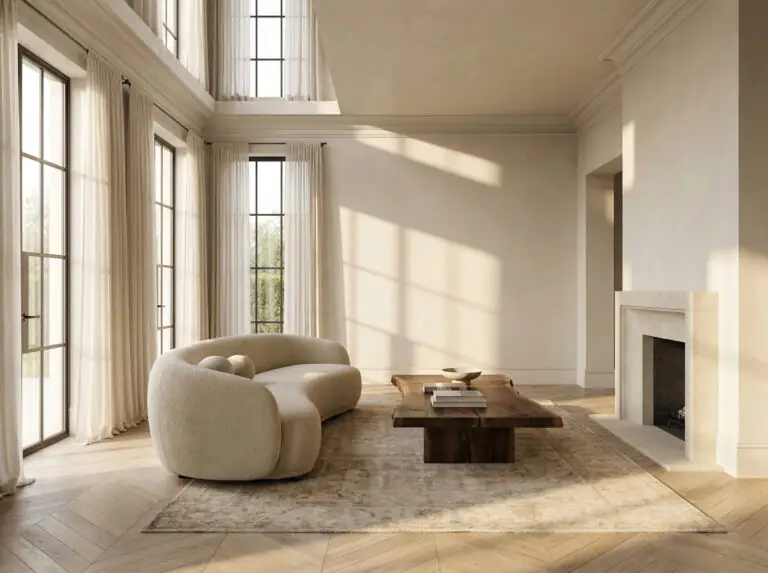
What Makes Off-White Different from Pure White?
Pure white generally has a cleaner, brighter appearance, while off-white contains a subtle undertone that changes how it looks in a room.
Some off-white shades lean towards yellow or cream, while others contain grey, pink, or green undertones. These variations affect which furniture colours and lighting conditions they complement best.
When choosing off white paint colors, think about the atmosphere you want to create. Warm off-white can make a room feel softer, while grey-based off-white can offer a more contemporary appearance.
Off-White Shade Families to Explore
1. Warm Off-White
Warm off-white shades have a gentle warmth that can complement wooden furniture, warm lighting, and traditional interior materials.
JKMaxx Paints' published off-white guidance includes shades such as Navajo White and Morocco Sand among its off-white options. These may suit living rooms, bedrooms, and hallways where a softer neutral is preferred.
Pair warm off-white with teak furniture, cream textiles, beige rugs, and brass accessories for a coordinated appearance.
2. Creamy Off-White
Creamy shades look warmer and may appear more distinctly yellow than a neutral off-white. They can work well in rooms with warm furnishings and traditional décor.
The brand's colour guidance lists shades such as Honey Cream and Vanilla Custard among its creamy mid-tones. If you want a shade that appears nearly white, test these against lighter off-white options before deciding.
Creamy shades can be particularly attractive in dining areas and family living rooms where a warm atmosphere is desirable.
3. Grey-Based Off-White
Grey-based off-white offers a more understated and contemporary appearance. It can work well with grey furniture, modern flooring, and clean architectural lines.
JKMaxx Paints' guidance identifies Chamois and Sesame as grey-influenced neutral shades. Compare them with your flooring and furniture to see whether their undertones complement the rest of the room.
This family can be useful when a creamy shade looks too yellow under your lighting.
Five Colour Combinations for Off-White Walls
1. Off-White and Natural Wood
Off-white walls pair well with wooden furniture, including beds, dining tables, cabinets, and shelving.
The light wall colour allows the natural grain of the wood to stand out without competing for attention. Add neutral textiles and warm lighting to create a cohesive interior.
2. Off-White and Beige
Beige creates a subtle contrast without introducing a strong colour. Use off-white across the main walls and introduce beige through a feature wall, curtains, rugs, or upholstery.
This layered neutral scheme works well when you want a calm, flexible interior that can accommodate different decorative styles.
3. Off-White and Light Grey
Light grey adds definition to off-white while maintaining a restrained colour palette. Use grey on one wall or through selected furnishings and keep the remaining walls light.
Choose compatible undertones. A warm off-white may look mismatched beside a distinctly cool grey, so test both shades together.
4. Off-White and Deep Blue
Deep blue or navy can create a strong contrast against off-white. A blue feature wall behind a sofa or bed introduces depth while the lighter walls maintain brightness.
This combination suits contemporary homes and can be adapted through cushions, curtains, and artwork.
5. Off-White and Sage Green
Sage green adds a natural accent to off-white walls. It can be introduced through a feature wall, furniture, indoor plants, or soft furnishings.
The combination works well in bedrooms, living rooms, and home offices where you want a fresh but understated interior.
How to Choose Off-White for Different Rooms
Living room: Warm off-white can complement wooden furniture, marble flooring, and neutral upholstery.
Bedroom: Choose a soft off-white that works with your bedding, curtains, and preferred lighting.
Kitchen: A light neutral can create a bright appearance. Check that the selected product is suitable for the intended wall surface and maintenance needs.
Hallway: Off-white can help connect adjoining rooms and provide a versatile background for artwork.
Home office: Grey-based off-white can complement contemporary furniture and provide a simple visual background.
Practical Tips for Choosing Off-White Paint
- Test samples on the actual wall rather than relying only on a digital image.
- Observe the shade in daylight and under your usual evening lighting.
- Compare the colour with flooring, curtains, furniture, and ceiling paint.
- Check whether the shade appears yellow, pink, grey, or green in your space.
- Confirm the exact shade name and code before purchase.
- Prepare the wall and follow the manufacturer's application instructions.
JKMaxx Paints' official off-white colour resource provides shade guidance and combination ideas. Use it to shortlist suitable options, then test your preferred shades in the room before committing to the full project.
Refresh Your Home for Upcoming Indian Festivals
Off-white is especially useful when planning seasonal decorations because it provides a flexible backdrop for different accent colours.
Before Diwali and Chhath Puja, pair warm off-white with brass accessories, terracotta décor, and traditional textiles. For Christmas and New Year, combine it with sage green, soft grey, or deep blue for a refreshed appearance.
During Makar Sankranti, yellow accessories can introduce warmth, while colourful decorations for Holi can stand out against a neutral background.
If you are repainting before a festival, schedule the work early enough to complete preparation and allow the paint to dry as directed.
Frequently Asked Questions
Is off-white a good colour for Indian homes?
Yes. Off-white can complement common interior materials such as wood, stone, marble, and neutral textiles. The right undertone depends on the room's lighting and furnishings.
What is the difference between off-white and cream?
Off-white is a broad family of near-white shades with different undertones. Cream generally has a more noticeable yellow or warm undertone.
Which colours go well with off-white walls?
Natural wood, beige, light grey, sage green, navy blue, and selected earthy shades can work well. Choose combinations that suit the undertone of your off-white paint.
Why does off-white look yellow at night?
Warm artificial lighting can emphasise yellow undertones. Test the paint under the bulbs you normally use and consider a different shade if the effect is too strong.
Conclusion
Off-white provides a versatile foundation for both traditional and modern interiors. Warm shades create softness, creamy tones introduce warmth, and grey-based options offer a more contemporary appearance.
When selecting off white paint colors, consider the shade's undertone, your room's lighting, and the materials already in the space. A carefully tested neutral can complement changing furniture and festive decorations for years to come.