

Anybody up for coloring Egyptian pyramids with Power BI? Just kidding :) How about creating nice looking triangle arrows for your comparison measures colored dynamically based on the values.
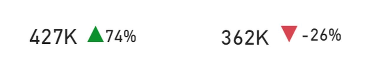
My goal is to assign up and down arrows or rectangles next to the year-over-year (yoy) growth percentages, colored green for going up and red for going down.
The measure next to the percentage arrows should look something like that:
To achieve this do as follows:
- Create a percentage (or any variance) measure like the YoY comparison. Example (current value / past values -1). Call it YoY Variance
- Create an arrow measure for the triangles. I created it as follows:
YoY Variance Arrow =
SWITCH (
TRUE (),
[YoY Variance] <= 0, UNICHAR ( 9660 ),
[YoY Variance] >= .001, UNICHAR ( 9650 ),
BLANK ()
)
Here you define if YoY variance is less than 0, then it takes the downward looking triangle, which is UNICHAR(9660). If its more than 0, then it takes upward facing triangle UNICHAR(9650). You can also define another character for 0 value, but I left it out of the exercise.
3. We need to create a coloring measure to paint upward facing triangle in green and downward facing in red.
YoY coloring format = IF([YoY Variance] < 0, 0, 1)
We give value of 0 for all the negative variance and value of 1 for positive.
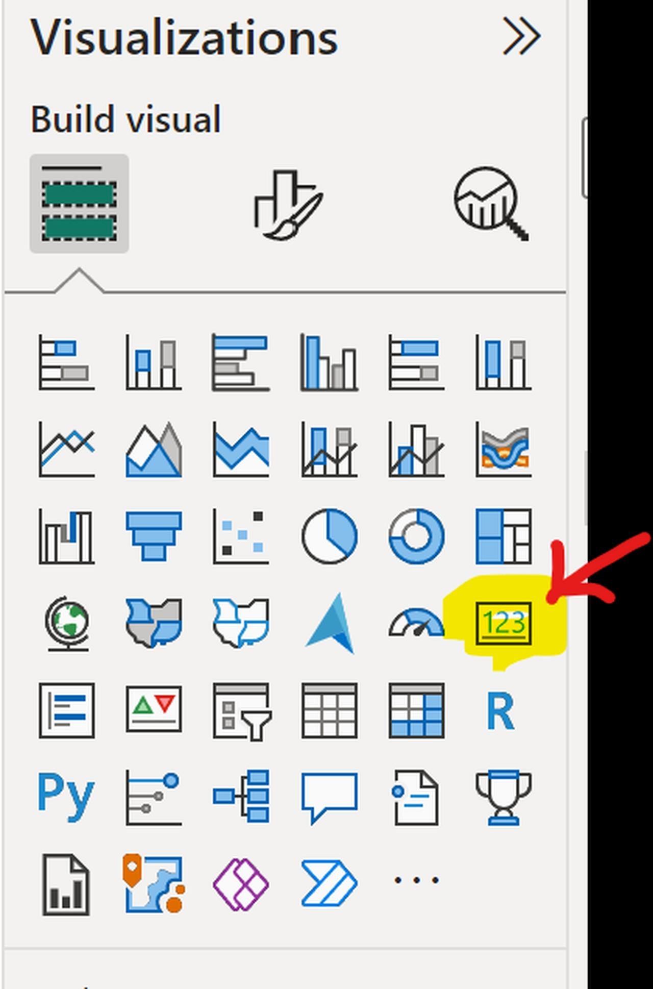
Now we need to insert 2 card visuals: 1 for YoY Variance to show percentage and the other for the arrow (triangle)
The card visual is located on Power BI visualization page, like I show below:
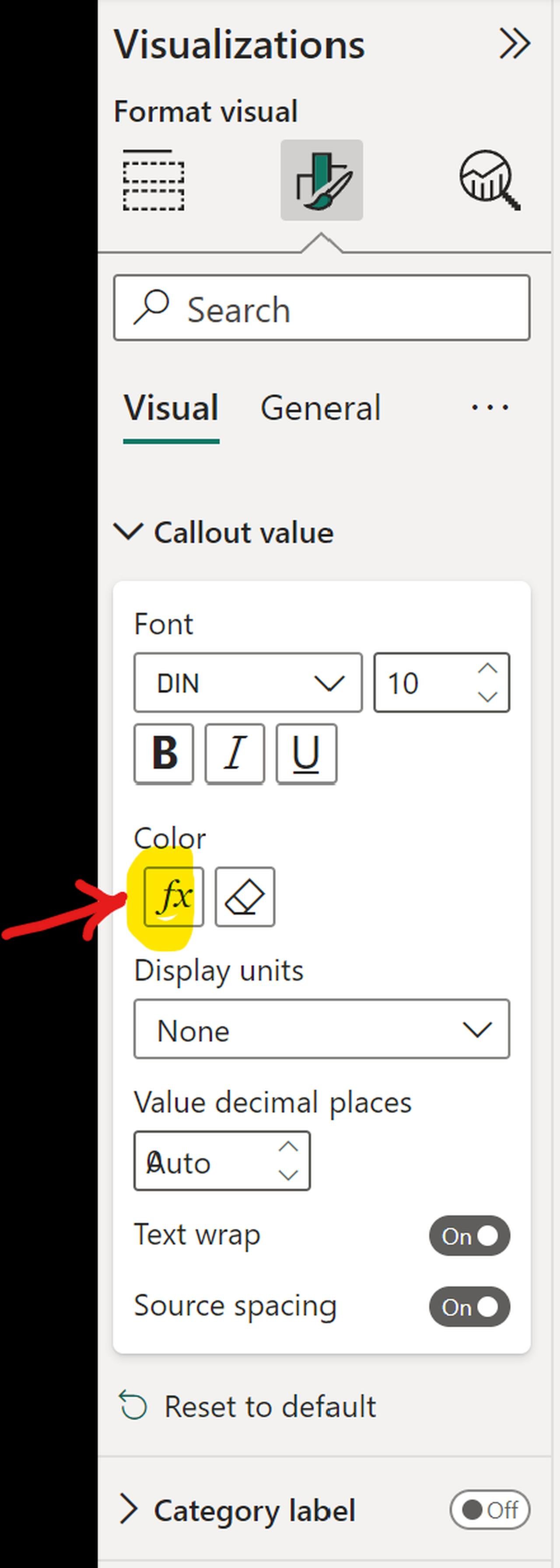
The next thing is to drag over our newly created measure [YoY Arrow] in the card visual. What you see next is the black triangle either pointing up or down. Now we need to color it.
To do that click on the visual, Format visual and on f(x) under color.
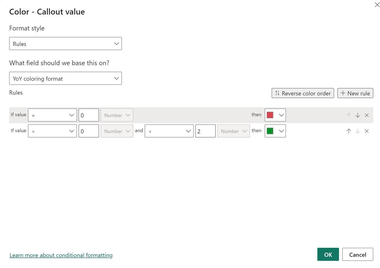
Once in the coloring menu, select Rules and chose the coloring measure we just created. Define which colors you would like for the value of 0 and 1.
Now you are all set with the arrow color. You can now resize your card and place it next to the percentage card measure [YoY Variance].
Now you can visit Egyptian pyramids and see them in color!